 |
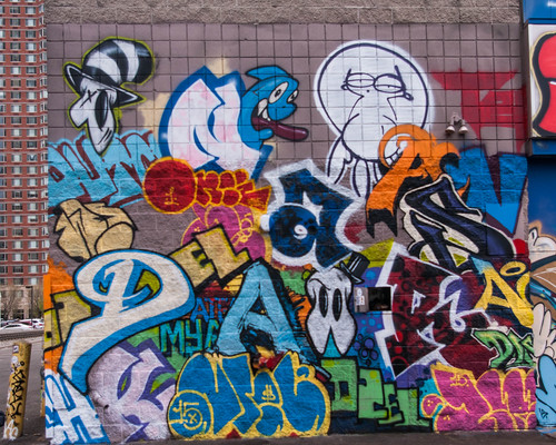
| AIDS crew |
Tomorrow (Saturday, June 28, 2015) marks the official opening of Green Villain’s Demolition Exhibition, a show of graffti installed (good Art Word, that) on 30,000 sq. feet of walls in the Newport area of Jersey City. Of course artists and others have been in and out of the building for the last two months, so the boundary between official opening hours and the rest of time and space is somewhat porous. But that will all come to an end sometime in July, when the building is demolished and returned to dust.
With all that in mind, I thought I’d offer a few comments on some of the styles in view. As far as I know graffiti styles have not been subject to classification and analysis beyond the standard distinction between wild style, in which the letters and cut up, confused, and disguised, and all the rest. So there is no official nomenclature. Nor do I intend to introduce any here.
But I do think it’s useful/helpful to note that it’s not all alike, especially if you’re not familiar with graffiti.
* * * * *
These pieces exhibit a ‘flat’ style, which may be the most common style in the show. There may be some 3D cues here and there, but they’re minimal. There’s no attempt to imply and overall 3D space. Notice the way patterns are deployed across the surfaces of the letters:
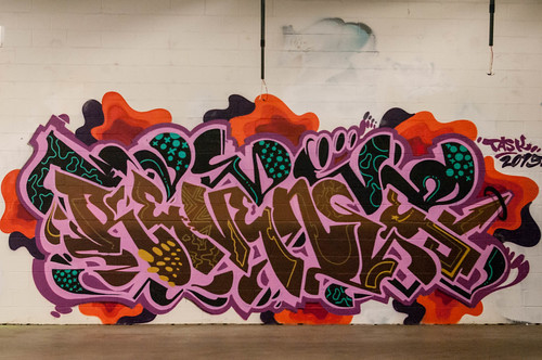 |
| Revenge |
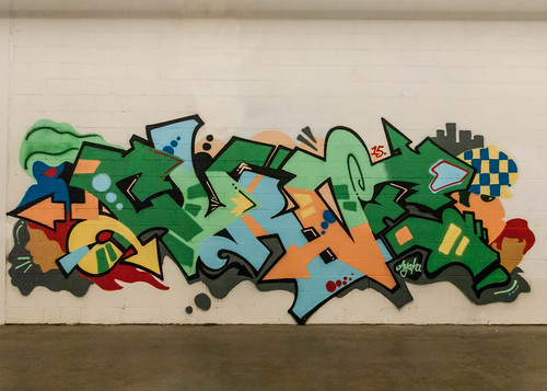 |
| CURVE |
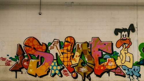 |
| SNOE |
This, in some ways, is flat. But the 3D cues (drop shadows) are very strong, though there is no overall 3D space:
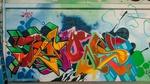 |
| Knows |
Here we’ve got a 3D space, though it’s shallow:
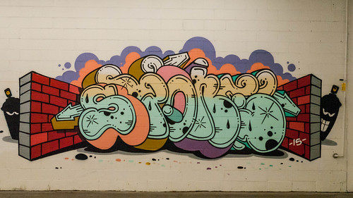 |
| SPone |
The next two have quite a different feel. They’re more ‘biomorphic’. It’s not simply that the forms are rounded, but they give a sense of plant growth. Note that the first has strong 3D cues while the second does not:
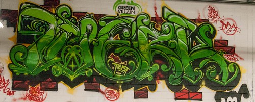 |
| Twerk |
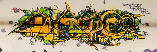 |
| Mustart |
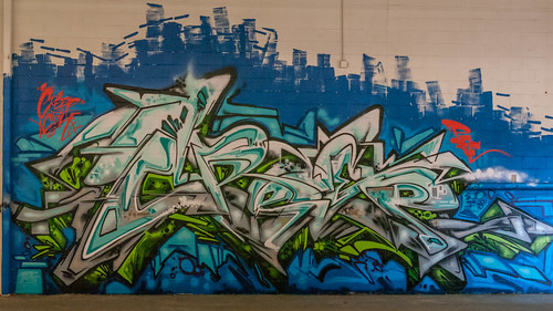
This too has a somewhat biomorphic feel, but it’s less contained than the previous two and the detailing is styled somewhat differently:
 |
| CREEP |
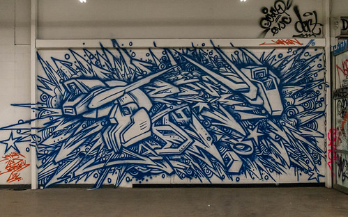
And then there’s this, which all but explodes off the wall:
 |
| Jahan Loh |
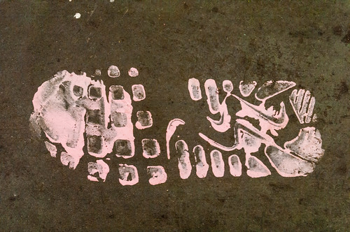
Finally, a footprint:
 |
| Homer Sapiens |
I rather suspect that it wasn’t deliberate. It just happened.
No comments:
Post a Comment