Another working paper, title above, link, abstract, and introduction below.
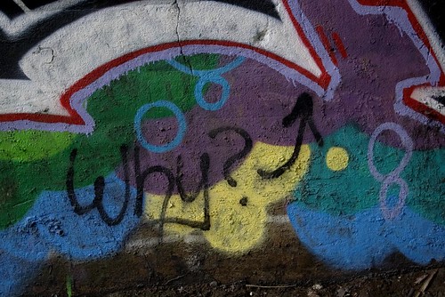
This image asks a question (notice where the arrow points):
I answer it at the very end of the post.
* * * * *
Abstract: Graffiti may or may not be art, and that may or may not matter. To those ends I discuss a half dozen or so pieces in different styles, show that, whatever his particular style, Ceaze’s letterforms do not overlap, identify X-form and ‘crazy organic’ as styles, and distinguish between ‘old school’ and wild style. Moreover, because of its insistence on the name as the basic matrix of a piece, graffiti may represent a break from the past comparable to the adoption of 3D perspective in the early modern era and the creation of abstraction at the beginning of the modern. Finally, graffiti exists on at least a half dozen different quality levels.
CONTENTS
Introduction: Graffiti Writing Art 2
Graffiti Aesthetics: Five Easy Pieces 4
Graffiti Aesthetics 2: Learning to See 9
Old School and Wild Style 9
Another Example 11
Triple-Logic 12
Styles of Derivation 13
Graffiti Aesthetics 3: Stylistic Identity 17
Graffiti Aesthetics 4: The Space of Writing 23
Graffiti, Is it Art? 27
Introduction: Graffiti Writing Art
Is it art? – that’s what they always ask. Is it art? As often as not the implied answer is, No, it’s vandalism, as though it couldn’t be both. Even if that’s not the implied answer there’s a sense that art is a well-defined thing and that one can answer the question by applying some well-known definition of that well-defined thing to the phenomenon of graffiti and voilà! out pops the answer, yes or no.
More sophisticated people know that Is it art? has been a preoccupation at least since Duchamp hung a urinal on a wall, in the wrong orientation, and dubbed it “Fountain”. Even with that under their belt, these more sophisticated people may be stumped by the question, and then launch into a long-winded exposition of the history of the 20th century plastic arts that manages to go nowhere. And so the question is left hanging, like Duchamps’ urinal.
Let it hang. The people who first created graffiti – by which I mean certain styles that originated in Philadelphia and New York City in the late 1960s and early 1970s – knew little about capital “A” Art and weren’t going there. For their descendants Art is somewhere between the enemy, irrelevant, and moderately interesting, depending on time of day, phase of the Moon, blood temperature, heads or tails, and a dozen other variables which may or may not sum to 42.
What I know is that when I walked along that corridor of columns (in Jersey City, NJ, near the Holland Tunnel, yet so far away), four abreast, extravagant colors and patterns eight feet high and twenty feet wide at the base of each, I thought I’d entered some wacked out Egyptian temple that had been decorated by priests who had been higher than the Saturn V that took Neil Armstrong to the Moon. I was overwhelmed. I didn’t know what I was seeing.
Is it art? Who gives a crap?
That was nine years ago. That’s when I decided to photograph graffiti. That’s when I decided to get a better camera so I could take better photos. And that’s when I decided to write about graffiti for The Valve, a group blog of mostly literary folks that I was writing for.
I posted the first four of these pieces to The Valve in August of 2007, almost a year after I’d begun photographing graffiti. I posted the last of them to New Savanna (The Valve has been defunct for a couple years now) in July of this year.
* * * * *
Graffiti Aesthetics: Five Easy Pieces: Informal commentary on five different pieces – “piece”, as you may know, is a term of art in graffiti culture and is a shortened form of “masterpiece”. In this post I was just ‘sampling the space’ of graffiti I’d photographed up to that point. Five pieces, five distinctly different styles. The first three of these no longer exist. The first and third have been gone over while the wall supporting the second has been destroyed. The fourth is obscured by a tree that fell on it during a hurricane, but the fifth is still there, hidden deep in the Bergen Arches, almost like a portal to the Lost World.
Graffiti Aesthetics 2: Learning to See: Here I take a close look at four pieces, three by Gas/Gaser and one by a writer who may be Abacus, but I’m not sure. I use Photoshop to cut into these pieces for analytic purposes. The point, of course, is that you have to learn how to see graffiti. You have to learn to see anything, but most of our basic learning has been done when we were so young that we no longer remember it as learning. I’d say it took me six months or so before I had a sense that I could see this stuff. And that was an active six months of taking photographs, rendering them, posting them to the web, and chatting about them. I also did a fair amount of reading about graffiti.
Graffiti Aesthetics 3: Stylistic Identity: First I look at three different pieces, simply making the point that they are quite different styles. Then I examine four distinctly different pieces by Ceaze and show that, while they are quite different, they share one stylistic feature. The letter forms do not overlap one another, or do so only minimally. This is certainly not true of all graffiti – it’s not true of the Raels piece on the front of this document, where the different letterforms reach around and through one another – but it seems to be true of Ceaze. What’s that about?
Graffiti Aesthetics 4: The Space of Writing: This is a more ambitious piece in which I point out that major developments in Western art have involved a reconceptualization of pictorial space. In the early modern era (aka the Renaissance) rational 3D perspective was developed and it came to dominate painting and drawing well into the 19th century. And then it began to dissolve. The cubists went one way, the abstractionists when other ways. Space dissolved into the flat surface of the canvas. I argue that, with its emphasis on the name, on linear forms whose importance is in their distinctness from one another more than their basic spatial matrix, graffiti is proposing a new aesthetic space and, hence, a new aesthetic mode. But is that what graffit is doing, and is a new aesthetic mode emerging? Only time will tell.
Graffiti, Is it Art? – There it is, the basic question. I ask it, but don’t answer it. What I do ask is: How many distinct levels of quality can we see? I asked that question in the context of a specific exhibition, for which I served as an advisor: The Demolition Exhibition. I saw three levels at the exhibition. But there are several levels below anything at that exhibition, and one or two above. If graffiti exhibits, say, six or seven quality levels, are the best of them art?
As for that Demolition Exhibition, that was a major event. You can find out more about it:
The exhibition was organized, managed, and curated by Green Villain. Here’s the website: http://www.g.reenvillain.com/gvm004
Blog posts at New Savanna: http://new-savanna.blogspot.com/search/label/PB%20Graff%20Jam
#GVM004: The Demolition Chronicles: A 67-page report on the exhibition, URL: https://www.academia.edu/13981255/_GVM004_The_Demolition_Chronicles
My Flickr album for the exhibition: https://www.flickr.com/photos/stc4blues/albums/72157655046573570
Finally, look for the hash tag #GVM004 – https://www.google.com/search?q=%23GVM004&ie=utf-8&oe=utf-8
* * * * *
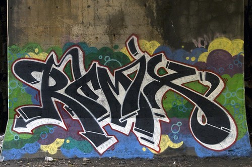
I took this photo on July 6, 2007.
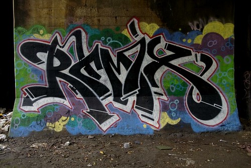
Notice that there is a single red outline around the name, "Remix". I took this photo on August 23:
Notice anything different? Hence the question. Graffiti aesthetics.


No comments:
Post a Comment