 |
| Example 1 |
Here’s what Michael says about these sheets:
I originally wanted Life as Jamie Knows It to include, between chapters, samples of these towers, but (a) that would be way too expensive and (b) you really need to see these things seriatim to get the full effect. Janet and I have framed some of them – we hung two in our New York apartment and gave some to family members – but however beautiful some individual pages are, the effect of having 35 of them in a row is even more remarkable.
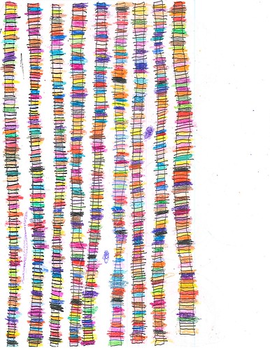
Some obvious things (see example above): the towers run the height of the page; they’re relatively narrow; and the colors change from one segment to the next within a tower. When coloring individual towers Jamie is, for the most part (we’ll get to that later) following his principle of local contrast. However, if you compare adjacent towers, it is not at all unusual to see adjacent regions with the same or highly similar colors for a segment or three. Is Jamie treating each tower as an independent entity, so that such conjunctions are fortuitous, or are such conjunctions deliberate? I don’t know. But I’m inclined to think it’s deliberate.
There’s something else that’s deliberate, and puzzling. Counting from right to left, about a third of the way down and between the second and third tower there’s a blue spot. Go over two columns and, between four and five, you’ll see another blue dot further down the page. Several to many of the sheets have such dots. I don’t know what they’re doing, nor does Michael.
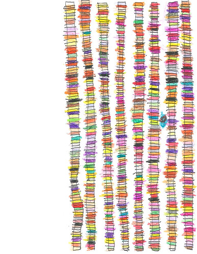
Example 2 (below) is much like Example 1 except that the towers start from the right edge rather than the left.
 |
| Example 2 |
Notice the local variation, the ‘color coupling’ between adjacent towers, and one of those spot, halfway down the page between two and three (counting from the right). If you look closely you’ll see that this one is black, and on a turquoise background.
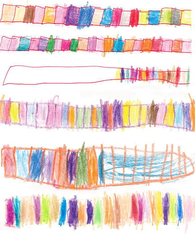
Now let’s look at some precursor examples to get some idea of how Jamie’s tower technique emerged. I created Example 3 using segments from several sheets of early work:
 |
| Example 3 |
Starting at the bottom we see color swatches without any outline. Immediately above it we’ve got an outline, in crayon; but in the right-hand region Jamie’s just scrawled a patch of blue across several regions. Notice also that he seems to have drawn an outline, then put in the cross bars, and then the color fills. In the middle we see one that approximates his mature technique, except that the outline, like the fills, is in crayon and, of course, it’s horizontal rather than vertical.
Third from the top we see an interesting change: Jamie is now using pen and crayon. He used a dark red pen to draw an outline; notice, in particular, that he drew it as one continuous line, but without closure at the right. There are no cross bars, but we see some color patches starting from the right.
In the top two examples Jamie is once again using both pen, for outlines, and crayons, for fills. Notice that each individual fill patch has its own outline. I’d like to know how he drew these. Did he draw all the outlines, and then do the fills, or did he draw an outline, fill it, and then on to the next?
None of these is quite like his mature technique but we can see that he is trying out various schemes. In particular he is separating the outline process from the fill process. It’s not clear just how that came about, step by step, but the result is that the outlines are done first, and with pen, and then the fills are done, in a different medium, crayon.
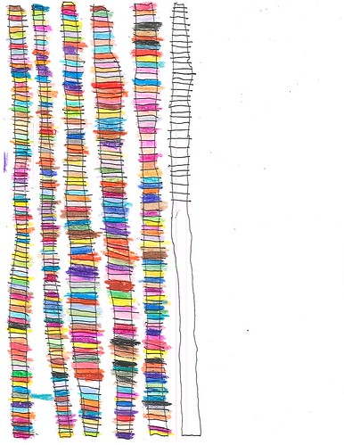
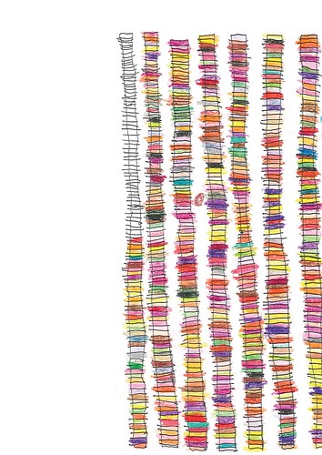
If we examine the next two examples, from his mature style, it becomes obvious that he first draws a tall slender rectangle, and then the cross bars (Example 4) and then adds the fills, starting from one end (Example 5):
 |
| Example 4 |
 |
| Example 5 |
* * * * *
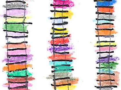
It’s time for a closer look. Example 1a is a patch from the upper left of Example 1 (about a quarter to a third of the way down, along the left edge).
 |
| Example 1A |
Notice that the crossbars almost always go beyond the verticals. Given that Jamie has had problems with fine-motor control, it’s possible that’s at work here. But I doubt it given the motor control evident in, for example, the block printing in his many lists.
Notice also that the color patches do not exactly match the rectangular cells created between the cross bars (top and bottom) and the vertical lines (left and right). I’m pretty sure that’s deliberate. If you look at the lower right you’ll see that there’s a brown patch that stretches across two segments. As we’ll see, that’s not an isolated instance, though it’s not frequent. Note the diagonal line of yellow patches just above center. Deliberate, fortuitous? Or perhaps both. Finally, there’s an empty segment just above the rightmost yellow segment, and it seems to be ‘matched’ by another empty segment at the left edge. The interesting thing is that Jamie does leave some segments without a fill. We saw the same thing with his dots sheets.
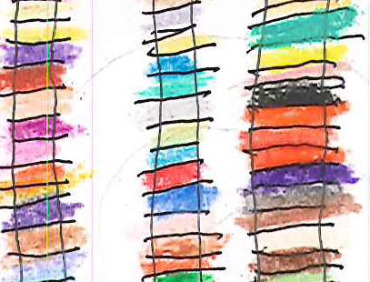
Example 1B is also from Example 1, at the middle right. It exhibits most of the same features we saw in 1A, including an empty segment, and even a yellow diagonal.
 |
| Example 1B |
The reason I pulled it out, however, is the sequence of three cells at the right, all filled with red. Is this the only instance of three contiguous cells being filled with the same color? I don’t know; I haven’t looked. Maybe yes, maybe no, but I’d suspect there are other instances.
What seems to be going on is that Jamie is treating the structure of black lines as a framework against and within which he ‘weaves’ patches of color, which are not bound to the frame in a strict ‘color between the lines’ manner. We know that there is one area of the visual brain that deals with form and a different one that deals with color. It looks like Jamie is playing them off against one another. The lines are there to please the form system and the colors are there to please the color system.
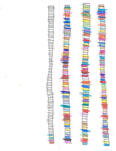
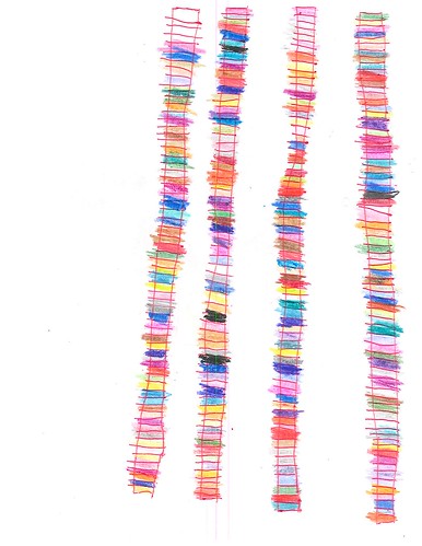
Finally let’s turn to the problem of composition: How do we arrange objects on the page to create an overall pleasing effect? In the towers drawings Jamie deals with that problem by starting along one edge and moving across the page, tower after tower. For the most part the distance between adjacent towers seem to be about the same as or smaller than the width of a tower, though Jamie has experimented with wider spacing, as in Examples 6 and 7:
 |
| Example 6 |
 |
| Example 7 |
Notice in Example 7 that the towers seem to diverge a bit at the bottom, unlike in 6. I bring it up because it’s relatively easy to keep a tower strictly vertical if you can track a nearby vertical, like the paper’s edge or the next tower over. But as the distance between towers increases, that becomes more difficult.
But what, you may ask, what about overall composition? Doesn’t Jamie ever finish a page? I asked Michael the same question and here’s what he said:
And yes, he fills the page with towers now and again. Those are the ones we have framed. My guess is that he works on a sheet of towers until he is interrupted (by meals, errands, going to the pool, whatever) and then does not resume a page where he left off, but starts a new one. The same is true with his pages of lists. His legal pads have thousands of pages on which he has written only a few lines.
I’ll buy that. And the implications are potentially quite interesting. It’s as though Jamie is living in his own personal version of Groundhog Day, where each sheet of paper is a new day. When the day’s over, it’s over, regardless of what’s been accomplished. A new sheet of paper is a new day, new towers to build.
And that may speak to another question that has perhaps formed itself in the back of your mind: Doesn’t he ever get bored doing the same thing over and over? Why should he, and they’re not exactly the same, are they? Did Mondrian get bored painting all those grids? What about Rothko and all those rectangular color patches? Pollock and the drips and splashes?
* * * * *
Let me tell you about the sandbox by father built for me when I was very young. It was out in the back yard and it was fairly large. Two or three kids could fit inside it easily, along with our toy trucks, cars, planes, tanks, and men of various sorts. And of course our pails and shovels. We’d have a great time digging trenches, building forts, and moving our toys around in this world as we played at whatever. Play would just go on and on. It was difficult to break it off when I was called to dinner.
And then one day I realized that the thrill was gone. It was no longer so easy to slip into the zone and become absorbed in the play. The sand was now merely sand and the toys were fancy hunks of plastic and metal; they were no longer magical beings. Before that moment, that realization, before then, that’s where Jamie is when he’s covering a shoot of paper with as many towers as he can construct in a Jamie-day.
And that, my friends, is art.
No comments:
Post a Comment