The two previous posts in this series – What’s an Aesthetic? and What’s an Aesthetic? – 2 – used simple visual material and were mostly about light and color. We had a simple object in the foreground and it was cleanly and dramatically separated from a simple background. The second post, however, ended with an image involving fairly complex geometric manipulation (though it was simple enough to do in Photoshop). And that manipulation gave me the idea for the images in this post.
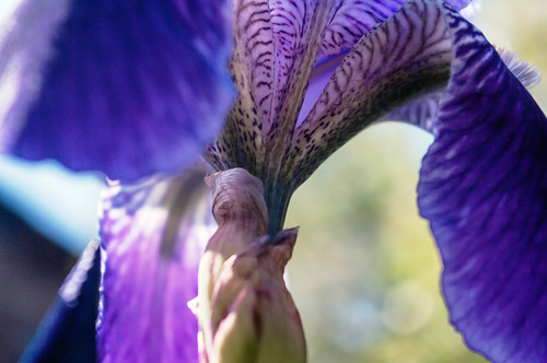
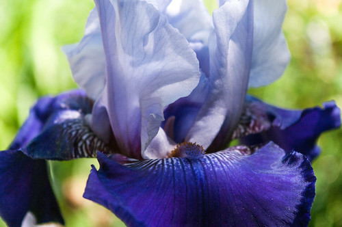
What, if instead of simple visual material, I start with complex visual material? I decided to work with a photograph of an iris, but not a standard shot. I took this shot blind, from below – I held the camera low to the ground, angled it up toward the flower, and snapped the shot when the auto-focus had clicked:
We’ve got rich colors and a complex floral form that almost blurs into the background at points.
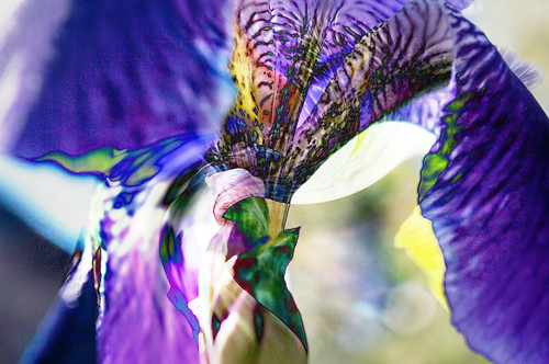
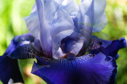
Now we start messing with the geometry. If you just saw this image alone, with no commentary, it might take you awhile to notice that it has been manipulated:
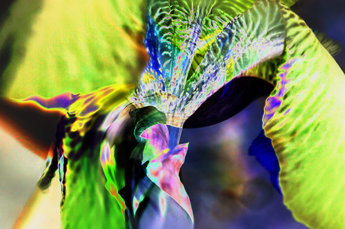
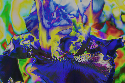
The most obvious evidence is at the bottom center. In this image I’ve manipulated the color in an anti-realistic way:
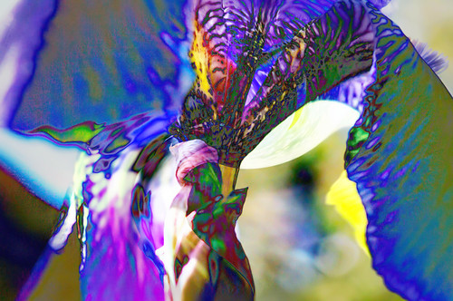
I’m not sure what I think of that one, but . . . I decided to cross it with a more natural seeming one to get this:
Notice the green areas in the blue/purple petals at the left and right.
Are these images visually interesting, even compelling? Yes, on the first, not sure on the second. It’s worth playing with, though I’m not sure to what end.
Here’s another series. I’m shooting another iris, but a different variety – different coloring. And the shot is a more canonical shot, from the side. First we have an unadorned image and then one where I’ve again played with the geometry a bit. Again though, you have to look closely to see what’s going on or you’ll miss it:
And now we manipulate the color:
Do I like it? Don’t know. But I find it interesting.
Of course, I’ve done this sort of thing before and let it go. And perhaps I’ll let it go this time as well. After all, you can’t do everything.
We’ll see.
The process has its challenges. It takes a lot of playing around to produce these images. Depending on what I’m doing, each image involves three or five or more steps, with perhaps a dozen or more trials in some of those steps. As I’m working I tell myself that I should take notes on what I do for each image so I can re-create the steps later with other material. But that would take more time and interrupt the flow. I’m not sure how important the flow is, but the interruptions would, at best, be tedious.
Still, I leave a partial record of what I did in the file name. Thus the name for that last image is “20150514-_IGP3689 Tw Hl Lvls”. The pair of numbers is simply the file name the software assigns to the file. The letters say a bit about what I did to the image. “Tw” means twirl; I used the twirl option on the Photoshop’s Distort filter to manipulate the image geometry and then faded the manipulated image into the original. The “Hl” means “Hue-Lightness”, though I suspect I altered the saturation rather than the hue; but maybe not. This system, as you can see, is not very precise. But the notations get me to think just a little about what I just did. The last set of letters, “Lvls” means “Levels”, which is more color manipulation. That’s the step that introduced all those weird colors into the image.
Let me conclude with an obvious point: there is manipulation and there is manipulation. It is one thing to manipulate a photograph in a way that maintains the appearance of realism but “fakes” the reality depicted in the image. You can add or remove objects, change the color or shape of object, but in ways that preserve the illusion of verisimilitude. That’s not what I’m doing. These geometric manipulations destroy the illusion of verisimilitude, as do the color manipulations. What you’re looking at is obviously a photograph, but one that uses a real image as the starting point for something else, something that lives between representation and abstraction.
That’s a big territory to explore.
* * * * *
Many of the posts tagged “photography” raise similar issues.
No comments:
Post a Comment