I was discussing this question with a writer friend over the weekend, though my end of the question was mostly about my aesthetic as a photographer. That’s what I want to discuss here.
Photography, so commonsense would have it, is about representing the (visual) world as it really is. Any thoughtful person who’s spent time with photography knows that that’s problematic and I note that, in painting, “photorealism” is but a form of realism. There are subtleties.
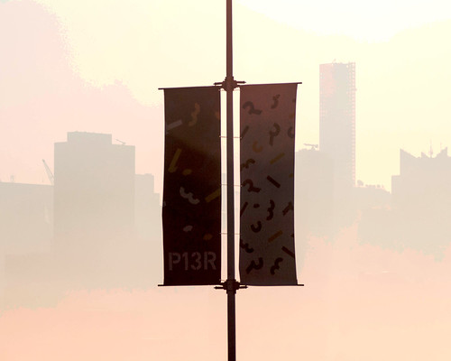
But let’s start with a crude distinction, between representation and abstraction. Photography is a medium for representing the visual world. Consider this recent photograph:

What does it represent? Of course, I know, because I took the photo, but it might not be so obvious to a stranger to that scene. Still, it doesn’t seem like a great mystery, does it?
The background looks rather like a skyline. As for the foreground, we have a vertical post flanked by a pair of panels. There’s some figuration on the panels and we see “P13R” at the bottom of the left-hand panel. That, perhaps, is about as far as we can go starting from nothing – though no doubt Sherlock Holmes could do better.
Just that much is enough, I suppose. The image represents something. Something of what it represents is obvious, while leaving other things somewhat mysterious. Those markings on the panels, what are they? At least two of them are letters, P and R, and two of them are numerals, 1 and 3. The others are sorta like that, but not specifically identifiable.
The fact is, I didn’t take that shot out of a desire to represent whatever it is in the photo. I’m not particularly interested in showing something specific to you, though I’m interested in the fact that the images DO represent something specific.
I’m also interested in the photo as an abstract visual composition. THAT’s what attracted me to the shot when I snapped the shutter. We’ve got a sharp and dramatic contrast between the foreground and background, and the image is strongly symmetrical on the vertical axis (left-right) and weakly symmetrical on the horizontal axis (top-bottom).
That’s what interested me. That and the fact that this abstract composition also represents something. I suppose that I’m interested in balancing abstract composition with representation. I want you to hold both in your mind. If the objects represented are too strong, too obvious, then you’ll see them and not be aware of the abstract form. If there were nothing but the abstract form, then the mystery of representation would disappear.
And there’s more. Let’s get at that first by knowing what we are in fact looking at. I took the shot early in the morning while standing on the shore of the Hudson River in Hoboken, New Jersey, and looking across the river at Manhattan. That’s the Manhattan skyline in the background while those banners in the foreground are in Hoboken. They mark the existence of Pier 13, a small entertainment and recreation pier along the water. So, those panels were perhaps fifty yards away from me – I was using a long lens – while the Manhattan skyline was half a mile away. In between the two we have empty space.
What of the color? Is that how things appeared to my eye that morning? No.
The sun was low in the sky and I was shooting directly into it. All that light floods the camera’s censor so that the image that comes out of the camera is rather dark as the camera’s internal electronics just shut things down. I had to do a bit of work to get a more or less intelligible image out of it.
But the colors are off. Things did appear quite that yellow. There was quite a bit of mist on the river and it was whitish. The background of the left-hand banner was a solid medium blue what that of the right-hand banner was white.
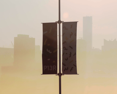
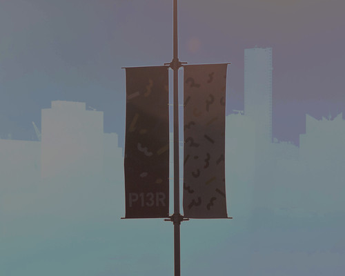
So, the color’s off. Yet, more or less believable. Here’s two other versions in the more or less believable range:
These realization, however, are not even remotely believable as depictions of what I saw. The geometry is there, but the colors are, shall we say, fanciful:
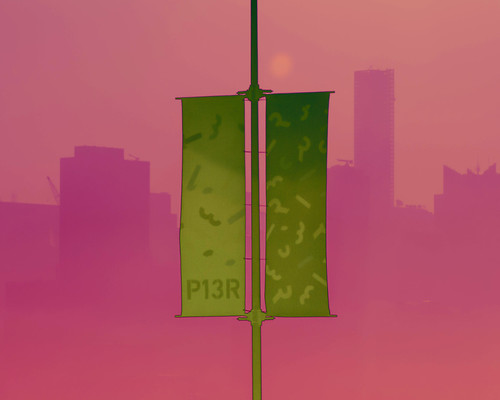
Once you start playing with color in Photoshop, the possibilities are endless. Now there are real choices to be made, if you’re going to play that game at all. I’ve spent a fair amount of time playing around with non-realistic color alterations. It’s fun. And problematic. Which colors do you want, and why? What’s the point?
I don’t know. I do know that when I do this I’m not trying to get THE perfect image. I like some better than others. I must have tried 30, 40, maybe 50, combinations to get the ones I actually developed. The ones you see are better in some why than the ones I didn’t bother with.
But still, as I said, I’m not looking for one perfect image. When I do this I’m thinking in terms of an ensemble of images. What makes an interesting ensemble?
You may recall that Andy Warhol would (have his assistants) do different color combinations of his multiple silk screen images and museums and galleries will, when they have several of them, display them as an ensemble. That’s the sort of thing I have in mind.
But to what end?
* * * * *
Many of the posts tagged “photography” raise similar issues.
No comments:
Post a Comment