
Showing posts with label tag. Show all posts
Showing posts with label tag. Show all posts
Tuesday, December 12, 2023
Friday, November 24, 2023


Wednesday, May 18, 2022

Tuesday, December 5, 2017
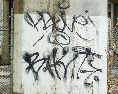

Saturday, November 21, 2015

Friday, November 20, 2015
Friday Fotos: Thursday Morning
I had breakfast yesterday at my favorite diner, the Malibu, on 14th street in Hoboken. Here I'm sitting in my booth looking out at an apartment complex. The blue lights are inside the Malibu and you can see part of frosted "M" on the window.
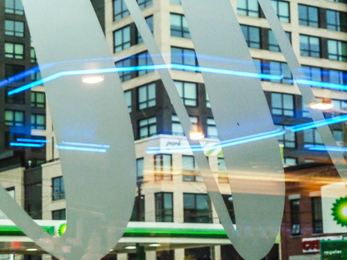
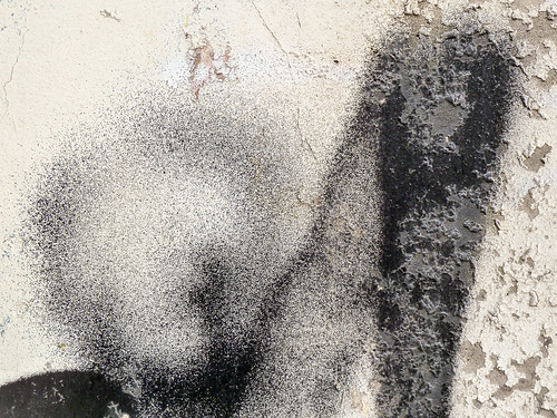
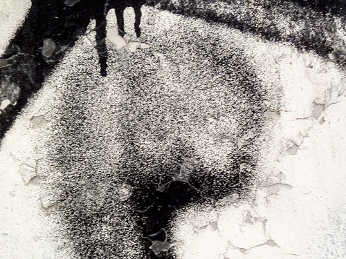
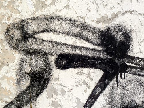
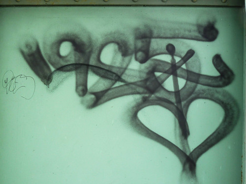
After breakfast I decided to take a stroll. So I went over a bridge to Weehawken, where I saw a variety of graffiti. This next photo is deceptive. At first glance it appears out of focus, but then if you look closely you can see tiny lines and spatters on the surface.
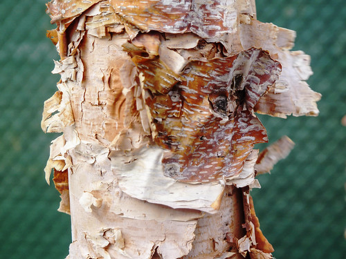
I've now touched ground in Weehawken and am heading back to Hoboken. I see a row of birches along the way.
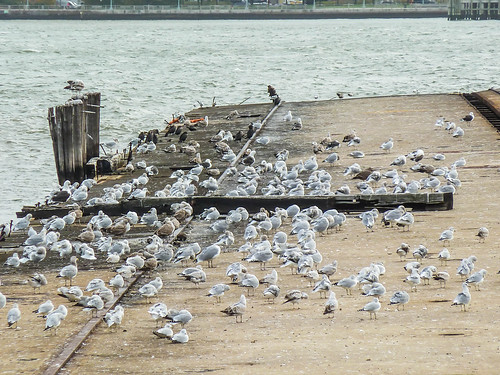
Now I'm walking along the river, past an abandoned pier. Some are in worse shape than this one. Some are entirely gone. And so have been preserved and fixed up. Looks like the gulls and geese are migrating for the winter.
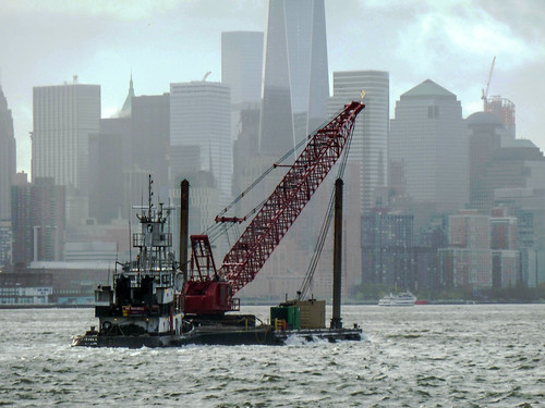
Finally, I tracked this small tug and barge moving a crane down river. The tall building in the center is One World Center.
Monday, October 12, 2015
Friday, July 3, 2015
Tuesday, October 28, 2014
Sunday, June 3, 2012

Monday, September 26, 2011
Let Me Paint You Higher: Space has the race
A number of years ago, 21 Nov 2006:

We're looking at the tags as they climb higher up that wall. Much higher, actually. How DO they do it?
Friday, October 22, 2010
Faith & Handstyles: Graffiti Affirmed
Roughly forty years ago a bunch of kids wrote their names wherever they could in New York City, but particularly in subway stations and on subway trains. Among them, Mike 171 and Snake. About the same time an adult photographer, Jon Naar, was commissioned to photograph those names and an adult writer, Norman Mailer, was commissioned to write about them. They approached their respective tasks dragging their worlds in tow. Mailer was at the top of his game, with reams of prose and a Pulitzer behind him. Naar was on the way up. And the kids, they were down, but not out.
None of them knew what they were doing, not in a larger historical sense. The kids were staking claims on their lives in the public space of New York City, a city that cared less about them than about others. Mailer and Naar? They’d been given commissions and were fulfilling them.
With style. All of them with style and commitment. The result, a book: The Faith of Graffiti. The book became a monument and graffiti itself went round the world. Forty years later we look back and see what became of them; we see them as seeds.
And so, forty years later, three of those people gathered with others to discuss then and now. The discussion was convened by the Wooster Collective, represented by Sara and Marc Schiller (his father commissioned Mailer to write the graffiti essay). Naar, Mike 171, and Snake were there; Mailer was otherwise disengaged. They were joined by a sociologist, Dr. James Dickinson, and a designer, Massimo Vignelli, a world-renowned designer who’d designed the signage for the New York subway system. When Snake and Mike 171 wrote their names on those walls, they were going up against Vignelli. The discussion was held in the Nineth Avenue offices of Knoll, a design firm that has commissioned work from both Naar and Vignelli.
The discussion was wonderful. Someone should have video taped it. I should have taken notes. But someone didn’t and neither did I. So all I can do is say that it was wonderful and add a word or two to that.
Mike 171 told us his story. Twelve years old when his father died, on the streets, acting out, getting up, white boy in a many-colored neighborhood. In particular, he told us the story of Cay 161, who’d given Mailer the name of the book when he told him “the name is the faith of graffiti.” It was a tale of the streets, of cops and a chase, of an injury. But I don’t remember it. Mike, of course, does. And we all heard him tell it, fresh as yesterday.
When asked what he thought about graffiti, about the names around the subway signage he’d designed, Vignelli took a breath, drew back a bit, explained that graffiti was vandalism, and that the social fabric was very fragile. Yes, we hear you, fragile. And then he pointed out that, of course, the fabric was already torn. Hence, graffiti.
What he liked were the tags, the handstyles, the spontaneous gestures. What he didn’t so much like were the elaborate and premeditated and elaborated pieces. Mike 171 followed him there, it was pure, innocent [yes! pure innocent vandalism] and then came the money and the galleries and it wasn’t the same.
Still isn’t.
But it is.
That wasn’t the whole discussion. It wasn’t just Massimo Vignelli, famed Italian-born designer now living and working in NYC, and Mike 171, uptown kid turned firefighter who made it out from under the rubble of the 2nd tower on 9/11. It wasn’t just them. Everyone had a say – Naar, the Schillers, Snake, Dickenson – but they were the hub, the axis, around which it all turned.
You shoulda’ been there.
And, yes, graffiti’s gone commercial. There’s an elite group of writers who make cash-money for their designs. But graffiti’s also circled the globe. It’s the only form of abstract art that’s found a mass audience. That’s worth thinking about.
As you think about it, think about Mike 171 and Snake getting up forty years ago, Naar photographing them, Mailer writing it all, telling the world why it’s important. Those worlds converging, conjoining, and spinning off their separate ways.
The kids are still at it. And the cops still chase them. But with a difference. Some of those cops were once writers themselves.
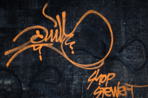
Here’s some handstyles (aka tags) from Jersey City. When you look at them, imagine yourself sweeping them out, feel it in your shoulder and arm. In not much more than the time it takes to sign your name, with care, that’s how long it takes a writer to transform a wall with an elegant handstyle.

Sunday, September 19, 2010
Conversations on Walls, some little ones
Graffiti writers do more than broadcast their name to all who pass by. They also send messages, short simple messages. Sometimes to one another, sometimes to the universe in general. I suspect that this message, a common sentiment, is addressed to the universe:

Here's one on a similar subject, though more positive in tone. It appears to be inscribed over an image of a duck, who looks rather like Donald (better not let Disney lawyers see this flic):

Here's a rather more complex little story. The throw-up is by Sol, who's gotten up quite a bit in the area. Enough so that he's ruffled many many feathers, writers who think he's disrespected them, though Sol disputes that. Whatever.

Saturday, September 18, 2010
Themo: Reading Graffiti
When got up on Monday morning I had no inkling that this week would become Graffiti Week at New Savanna. I figured that I’d do a review of The Faith of Graffiti, post it, and that would be that. I’d move on to other topics for main posts. However, that’s not what happened. Graffiti Week is what happened, so let’s get back to it.
I want to think out loud about the process of reading graffiti, or seeing the letters. FWIW, these remarks are in counterpoint to a discussion elsewhere in the blogosphere where the topic reading literary texts, which is a nasty nasty topic, very messy.
Let’s start with a simple example. Look at the vertical beam on the left side of the following photo. There’s a name there: Themo. The “m” may be just a bit fancy, but there’s no trouble reading those strokes as an “m.” I will observe, in passing, that there are any number of ways to write one’s tag. The best writers develop a distinctive style, known as a hand-style.

Now look at this photo:

I didn’t read it as Themo when I first saw it. All I knew is that it said something, and that I liked it a lot. This, of course, is not a tag, it’s not done with a few quick strokes from the spray can (or with a marker of some sort). This is a bit more elaborate, over six feet high and perhaps 10 feet wide. And yet it is very free and fluid, as though it had been dashed off quickly.
Now, once someone told me to read it as “Themo,” I didn’t have any problem seeing it that way. The “T” is obvious, as is the “h.” Notice that the vertical stroke of the “T” is joined with the tall vertical of the “h” at the bottom. In the printing trade such a combination is known as a ligature. Moving to the right, the upper part of a lowercase “e” is partially obscured by the ‘knee’ of the “h.” It’s small, but it’s there. The “e” overlaps the leftmost vertical stroke of a capital “M.” Last, we have the “o,” which is partially overlapped by the “M.” Just to the right of Themo there’s something that looks like a large, but partially erased, numeral 5. That probably belongs to the Themo, but I’m not sure. The coloring appears right.
Sunday, June 6, 2010
FR8s: Graffiti on the Move
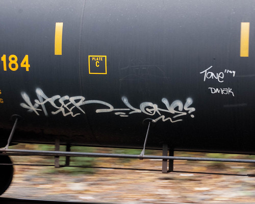
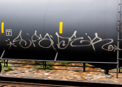
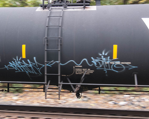
My friend John Emerson reminds me that graffiti on freight cars travels all over the country, not just in urban areas. And so it does. Graffiti on fr8s is probably as old as fr8 trains, which isn’t all that old. But the contemporary practice derives from the graffiti that went on subway cars in New York City back in the day. That ended in the early 1990s, I believe, when the officials figured out how to come down hard and successfully on graffiti writers. Since then, most graffiti has gone up walls, both legal and not.
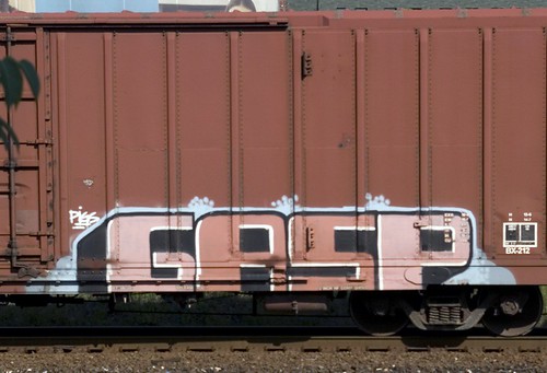
But the mobile art continues on freight cars. Here are a few photos from my collection. All were shot on the Bergen line in Jersey City and in almost all cases the trains were moving, albeit slowly. Let’s start with some characters from Aqua Teen Hunger Force:

Here’s a simple throwie (throw-up):
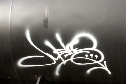
Here’s an elegant tag on a tank car (the curvature seems to discourage piece work):
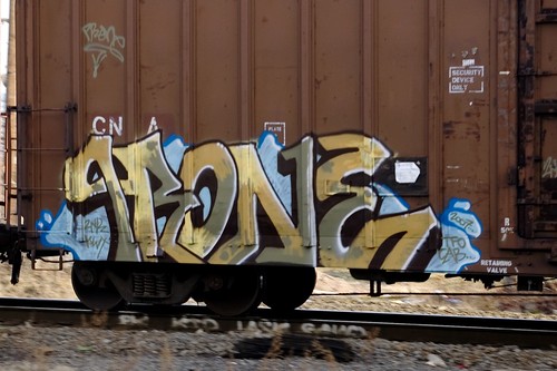
And simple, but elegant, piece:
This one is a bit different:

It’s a straight-forward statement, rare for such graffiti. Note, however, that shadowed lettering, indicating a writer with some skill. While I took the photo in November of 2008, I assume, but don’t know, the statement was made shortly after 9/11/2001.
Saturday, May 1, 2010
Graffiti Chaos 1
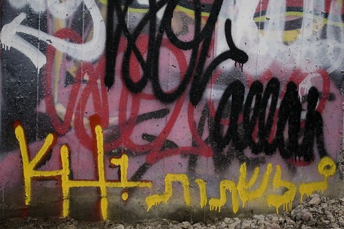
Just some writers painting over one another in odd spots here and there. This is, say, 30 inches wide and 20 inches high (and, yes, that's Hebrew at the lower right, by HK1, aka Kosher Howie):
This, on the other hand, is quite large, say 15 to 20 feet wide and 10 to 13 feet high, and not so chaotic, just crowded:
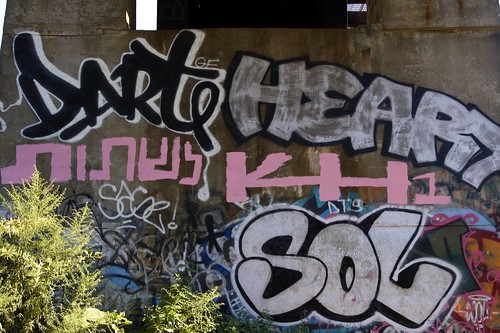
And, yes, more Kosher Howie, and Sol, Dart, and Heart, among others in the top layer.
Sunday, April 18, 2010
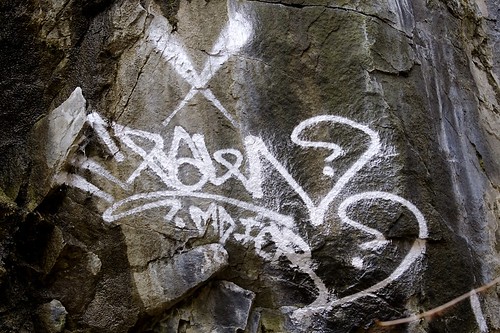
Raels Tag
This tag is by Raels. It's in the Bergen Arches aka the Erie Cut, a mile-long trench in the middle of Jersey City. It's now deserted save for homeless people, graffiti writers, and hikers, but it once took four railroad tracks down to the Hudson River.
Subscribe to:
Posts (Atom)