Showing posts with label graffiti aesthetics. Show all posts

Monday, June 7, 2021

Graffiti, context, photographing street art, and the spatial complexity of urban infrastructure [Jersey City Mural Festival]

Pull up a chair and let’s talk.

Jersey City just had its Jersey City Mural Festival. I’ve even heard it referred to as “the first annual”, implying that it will happen again. I’m all for it.

I went to the Hamilton Park site early on Saturday afternoon and photographed all the walls, if not all the art – much of it was still in process. Now, as some of you may know, perhaps the major issue in photographing graffiti and street art is whether or not you capture only the art, or as close to it as you can, or you photograph the context as well. I’m in the context camp, though I’ve taken many photos that concentrate on the art itself. On Saturday it was difficult, though by no means impossible, to avoid context. Most of the art was incomplete, the artist was often on the wall, and there were people everywhere.

I was in heaven – speaking metaphorically. I particularly enjoyed the areas underneath the 12th street viaduct where you could see the ironwork and which were crowded with people. That spatial complexity – the walls, the ironwork, the people, and the play of light – is interesting in itself.

But I went a bit beyond, or perhaps it was behind, the festival space to photograph more ironwork, graffiti, and masonry. Look at this map:

The white line more or less encloses the area where the festival walls are located. The yellow area is where I went, underneath the 12th Street viaduct. I’ve been there many times before, photographing the graffiti on the concrete stanchions and on the trailers that were often parked there.

This small ACRO piece invites us in:

Notice the ramp leading from the 14th St. viaduct above. Look at the ironwork!

In this photo I’m directly under the 12th Street viaduct looking east, toward the festival area; you can just barely make out the ice house, flooded in light, at the left.

Why don’t we turn to the right:

We've got ironwork, stressed concrete, and murals, all playing in the light.

I remain under the viaduct and turn further to the right, looking toward Dickinson High School. Just below Dickinson, curving along Bergen Hill, we'll find the path of an old trolley line that led into the Bergan Arches and then crossed over the chasm to the Heights just before Baldwin Avenue.

Back to looking at the 14th St. viaduct flying above graffiti on the ground:

Why don’t we leave the way we came in, past ACRO:

I can’t resist. One more taste before we leave. This is at the foot of one of those concrete stanchions supporting the thruway:

Now we’re back in the festival area. We came through that gate to get to these "back" areas. I assume that once the festival is over that gate will be locked.

Sunday, October 28, 2018

Graffing the Future: Is the next phase of human cultural evolution being inscribed on walls by graffiti writers and street artists?

This post is from January 6, 2015. I'm bumping it to the top of the queue in honor of the Emergent Ventures grant to Leonard Bodgonoff.

20141213-_IGP1443

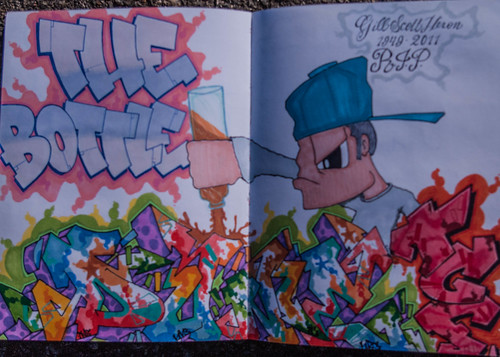
The Bottle, by DUNE UNO, Gil Scott-Heron 1949-2011, in ZAR's Blackbook [1]

I have a bias about the future, the deep future. We can’t predict it, for it’s too strange. It’s not simply a continuation of current trends into the future. Oh, sure, there is that.

But there is also radical change, captured in the concept of a singularity, a “moment” in human history that so changes the dynamics of human society and culture than those living on the past side of it cannot imagine much less predict the nature of life on the far side.

We are now living in such a singularity. It is breaking over and around us like a 12-foot wave breaking over surfers in the Banzai Pipe. We don’t know what the world will be like when the last energies of the wave have dissipated. All we can do is be prepared to create a new way of life on those shores.

Images Images (Photos) Everywhere

I am an intellectual. My main mode of acting is through thinking. And what I am thinking is that those distant shores began appearing before us in Philadelphia and New York City in the late 1960s and early 1970s. I am of course talking about graffiti, not just any writing on walls, but the particular kind of writing that appeared on those walls at that time, writing using aerosol paint as its instrument.

At the time most good citizens thought of it as vandalism; from a legal standpoint, that’s what it is. In his essay to the first “bible” of graffiti, The Faith of Graffiti, Normal Mailer called it art. I’m calling it messages from the future.

I note first of all that we are living in a renaissance of images. Everyone has a cell phone and uses them to take photos. As a recent Google report observed:
Since the dawn of time we’ve been captivated by images. But the web has turbocharged our ability to view, share and create more imagery than ever before, to the extent that visual imagery has become the dominant form of communication in the 21st century. No wonder smartphones and tablets sans keyboards are increasingly popular – they prioritize imagery above all else.

This bias towards imagery is creating a new sensorium – how we perceive and sense the environment around us. It has not only influenced how we engage in the digital space, but outside of it too.
In 2011 380 billion photos were taken, that’s 10% of all the photos ever taken. Most of those photos, of course, are quick and dirty. But as people take more and more photos they will inevitably be come more discriminating. The quality will go up.

It’s in that context that we have to think about the impact of graffiti. In an increasingly visual culture, visual imagery is ever more important. Graffiti is everywhere, and spreading. Photos of it are all over the web. Last year Google’s Cultural Institute launched the Street Art Project to showcase graffiti and street art from around the world.

From Human Origins to the Renaissance

With this in mind, let’s go back in time. While we’ve found cave paintings roughly 40,000 years old, we’ve got stone tools going back almost 2 million years. That’s important, as I noted in a review of Steven Mithen’s book on music (“Synch, Song, and Society”, Human Nature Review 5, 2005, pp. 66-85):
Obviously we have no record of these utterances, but the archeological record does have indications of cultural conservatism. The repertoire of stone tools was both limited and unchanged between 1.8 and 0.25 million years ago; Mithen gives particular emphasis to the constant form of hand-axes (164). Mithen suggests that, because their finely wrought form exceeds the practical demands of butchery, wood-working, and cutting plants, these hand-axes may have been fitness indicators in the sort of sexual selection regime Geoffrey Miller has advocated.

Beyond this, I note that Ralph Holloway (1969, 1981) long ago suggested that strongly conserved hand-axe form was an indicator of social norms. Those forms could not be conserved from one generation to the next unless there was a deliberate intention to do so. One has to note the significant features of an existing axe and discipline one’s knapping motions to produce that result. That is considerably more exacting than simply producing an axe with a sharp edge and appropriate heft. The motivation behind such exacting form, then, is not practical. Nor can it be merely aesthetic, which would allow for considerable individual variation. That leaves us with a desire to conform to social norms. Given the importance of such norms, that may in itself be a sufficient motivation for their form, to serve as a visible token of social solidarity. In any event, Holloway’s observation does not contradict Miller’s, and now Mithen’s hypothesis. Norms are norms, regardless of their specific purpose and norms that serve multiple ends are likely to be particularly strong.
My point is a simple one: the oldest evidence we have of specifically human cultural norms is of something that can be seen and therefor copied. Cave art, so far as we’ve discovered, is considerably newer. Other than those stone tools, cave art provides our oldest evidence of human craftsmanship.

Now let’s turn our attention to more recent events, the European Renaissance:

Filippo Brunelleschi Invented one-point linear perspective 1377-1446
Nicholas Copernicus Championed the heliocentric view of the solar system 1473-1543
William Shakespeare Playwright often credited with inventing the modern sensibility 1564-1616
Isaac Newton Synthesized the conceptual foundations of classical physics 1642-1746

It was the visual arts that kicked off the change, not literature and not science; they followed. Filippo Brunelleschi was one of the foremost architects and engineers of the Italian Renaissance:
Besides accomplishments in architecture, Brunelleschi is also credited with inventing one-point linear perspective which revolutionized painting and allowed for naturalistic styles to develop as the Renaissance digressed from the stylized figures of medieval art.
There is, of course, no assurance that the future will unfold according to patterns followed in the past. But if that happens, then our future is now being written on walls around the world.

The Case for Graffiti

Assuming that the visual arts are leading the way, why choose graffiti?

On the one hand, the “legit” art world is in turmoil. You can’t tell the hucksters from the genuine artists and, in any case, there is no definitive sense of direction. Artists, dealers, collectors, and museums are thrashing about.

Meanwhile, in the course of two decades from the late 1960s to the late 1980s graffiti made its way around the world and did so pretty much outside the art world. Graffiti represents a new starting point, a new conception of image space, and it’s the only form of abstract art to attract a mass audience.

Further, as it’s spread, graffiti has attracted other styles of art and imaging making and given birth to street art. Think of them together as an aesthetic laboratory in which all styles of art will be tested and tried. It’s through that experimentation that the enduring forms of 21st century art will first emerge, for that is where they will receive their sternest test and widest exposure.

On the walls of the world, the World-Wide Wall.

* * * * *

[1] All graffiti writers have a blackbook, more than likely they have several to piles of them. They're artist's notebook filled with blank sketch paper. They're called blackbooks because their covers are typically/classically black. Writers use them to sketch ideas, but also share ideas. So writers will sketch in one another's blackbooks. In this case DUNE UNO did a sketch in ZAR's blackbook.

ZAR is a writer in Northern New Jersey, Patterson I believe. I mention him in other posts here at NEW SAVANNA and have a bunch of photos of his work, including action in-progress photos, over at my Flickr page.

Friday, May 5, 2017

Sacred Things

From six years ago....
IMGP0005rd

… that still roaring dell, of which I told;
The roaring dell, o'erwooded, narrow, deep,
And only speckled by the mid-day sun;
Where its slim trunk the ash from rock to rock
Flings arching like a bridge;--that branchless ash,
Unsunn'd and damp, whose few poor yellow leaves
Ne'er tremble in the gale, yet tremble still,
Fann'd by the water-fall! and there my friends
Behold the dark green file of long lank weeds,
That all at once (a most fantastic sight!)
Still nod and drip beneath the dripping edge
Of the blue clay-stone.

-- Coleridge, This Lime-Tree Bower My Prison
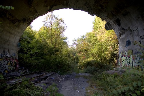
This post began, I suppose, when, upon reading Charles Cameron’s post, Sacred space and the imagination, the “graffiti!” light went off in my brain. Not just any graffiti light, but this one:

westward ho.jpg

Well, not that exact one, but it was a photograph of that same arch, a different photograph. This one shows the graffiti a little more clearly, but it’s not the same graffiti, as graffiti often changes over time, in some places more rapidly than others.

If you look back over Cameron’s images, you’ll see that it’s of a piece with them. And I’ve got dozens of photos of that arch: different times of the day, different seasons, different years, different graffiti, different angles. And that’s not all.

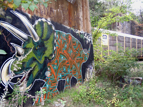
Graffiti and the sacred is a natural, one that hadn’t quite hit me full-on until I’d read Cameron’s post. You see, my first post about graffiti (the images, alas, are gone) was about this piece, which I called the Shrine of the Triceratops:

dino_train_872

It’s not that I believe, mind you, that there’s a triceratops cult in Jersey City and that this is where they meet. Nothing like that. Rather, that that image seemed to embody of the spirit of the place, the Japanese word is kami. (That triceratops is now gone. First, eroded by the weather, then other writers went over it.)

I could go on and on about graffiti, but I won’t, because this post isn’t just about graffiti. But I’ll leave you with one last graffiti thought. Graffiti is often likened to cave art. Well, cave art, some of it, perhaps all of it, is sacred art. Not mere pictures, but spirits bodied forth on walls.

Monday, September 14, 2015

Graffiti Aesthetics • Some Notes

Another working paper, title above, link, abstract, and introduction below. 

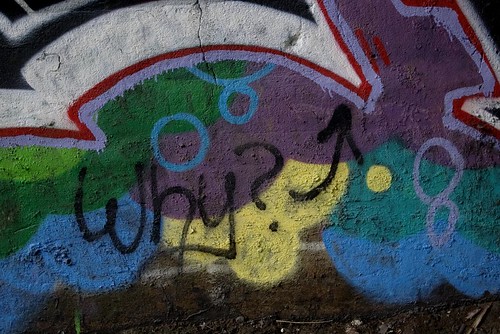
This image asks a question (notice where the arrow points):

IMGP3226rd

I answer it at the very end of the post.

* * * * *


Abstract: Graffiti may or may not be art, and that may or may not matter. To those ends I discuss a half dozen or so pieces in different styles, show that, whatever his particular style, Ceaze’s letterforms do not overlap, identify X-form and ‘crazy organic’ as styles, and distinguish between ‘old school’ and wild style. Moreover, because of its insistence on the name as the basic matrix of a piece, graffiti may represent a break from the past comparable to the adoption of 3D perspective in the early modern era and the creation of abstraction at the beginning of the modern. Finally, graffiti exists on at least a half dozen different quality levels.

CONTENTS

Introduction: Graffiti Writing Art 2
Graffiti Aesthetics: Five Easy Pieces 4
Graffiti Aesthetics 2: Learning to See 9
Old School and Wild Style 9
Another Example 11
Triple-Logic 12
Styles of Derivation 13
Graffiti Aesthetics 3: Stylistic Identity 17
Graffiti Aesthetics 4: The Space of Writing 23
Graffiti, Is it Art? 27

Introduction: Graffiti Writing Art

Is it art? – that’s what they always ask. Is it art? As often as not the implied answer is, No, it’s vandalism, as though it couldn’t be both. Even if that’s not the implied answer there’s a sense that art is a well-defined thing and that one can answer the question by applying some well-known definition of that well-defined thing to the phenomenon of graffiti and voilà! out pops the answer, yes or no.

More sophisticated people know that Is it art? has been a preoccupation at least since Duchamp hung a urinal on a wall, in the wrong orientation, and dubbed it “Fountain”. Even with that under their belt, these more sophisticated people may be stumped by the question, and then launch into a long-winded exposition of the history of the 20th century plastic arts that manages to go nowhere. And so the question is left hanging, like Duchamps’ urinal.

Let it hang. The people who first created graffiti – by which I mean certain styles that originated in Philadelphia and New York City in the late 1960s and early 1970s – knew little about capital “A” Art and weren’t going there. For their descendants Art is somewhere between the enemy, irrelevant, and moderately interesting, depending on time of day, phase of the Moon, blood temperature, heads or tails, and a dozen other variables which may or may not sum to 42.

What I know is that when I walked along that corridor of columns (in Jersey City, NJ, near the Holland Tunnel, yet so far away), four abreast, extravagant colors and patterns eight feet high and twenty feet wide at the base of each, I thought I’d entered some wacked out Egyptian temple that had been decorated by priests who had been higher than the Saturn V that took Neil Armstrong to the Moon. I was overwhelmed. I didn’t know what I was seeing.

Is it art? Who gives a crap?

That was nine years ago. That’s when I decided to photograph graffiti. That’s when I decided to get a better camera so I could take better photos. And that’s when I decided to write about graffiti for The Valve, a group blog of mostly literary folks that I was writing for.

I posted the first four of these pieces to The Valve in August of 2007, almost a year after I’d begun photographing graffiti. I posted the last of them to New Savanna (The Valve has been defunct for a couple years now) in July of this year.

Saturday, July 11, 2015

Once Again: Graffiti, Is it Art?

As often as not that question is asked in a context where the implied answer is, “no, it’s vandalism”. While that IS and important issue, and one that DOES interest me, that’s not what I’m thinking about now.

I’m thinking more about a version of the question that implies that ART has some essence, so identifiable mark, that proclaims it to be art. In that version, one proceeds by explaining what that essence is and how you identify it. This is a difficult question and, in fact, some aestheticians and critics have simply given up on it. There seem to be so many very different things that people call (legitimately) art that it’s too difficult specify what it is.

I’m sympathetic to that problem, so sympathetic that I’m not going to attempt to identify an essence and then pin it, or not, on graffiti.

I’ve got something else in mind: variety. Variety in style, variety in quality.

One post I did in connection with Green Villain’s recent Pep Boys project, Some Styles in the Demolition Exhibition, identified four different styles. Describing the differences is tricky, but seeing them is not. How many distinctly different styles were on display in that project, as I made no attempt at a complete survey in that post? Ten, twenty, but certainly not 50 – there were only about 100 artists involved. And of course we didn’t even come close to sampling the whole space of graffiti.

If you examined that whole space, how many different styles would you find? I might well be able to find 100 in the work I’ve photographed in Jersey City, and that’s just one relatively small region. World-wide would it be 1000, less, more? I don’t know. Are those significant numbers? What’s the comparison? I don’t know.

My point is simply that there is significant stylistic variety. We’re not dealing with a hodge-podge of more or less opportunistic and unschooled variety. There’s systematic variety, driven in part by the competitive need to differentiate yourself from others and, in part, by a desire for visual exploration.

Monday, July 6, 2015

Even Heather Mac Donald’s Welcome to Tag-Up at the Demolition Exhibition [#GVM004]

20150705-_IGP4888

A defense of graffiti’s egalitarian values in an age of oligarchic excess, financial gamesmanship, and ecotastrophe

Who the Eff, you ask, is Heather Mac Donald? And just why are you addressing her?

Heather Mac Donald is a well-known commentator and is the Thomas W. Smith Fellow at the Manhattan Institute for Policy Research. As the name indicates, it’s a Manhattan-based think-tank that, in its own words, “has been an important force in shaping American political culture and developing ideas that foster economic choice and individual responsibility.” Four years ago Mac Donald wrote two critiques of graffiti for City Journal, a quarterly published by the Manhattan Institute. The pieces were occasioned by Art in the Streets, an exhibition at the Los Angeles Museum of Contemporary Art, which billed it as “the first major U.S. museum survey of graffiti and street art.” And that, so far as I know, is true. It’s by no means the first time graffiti’s made it into a museum, but it was the first major retrospective.

One piece, Radical Graffiti Chic, is about graffiti and graffiti culture generally while the other, Crime in the Museums, is a review of the exhibition. Needless to say, she was not impressed. But she WAS angry and disgusted. Graffiti after all, is vandalism, as we all know. Moreover Mac Donald asserted that it’s not particularly accomplished or interesting as art, it does nothing to better the lives of poor communities, and, in the museum world it’s just something for rich oligarchs to play with while they’re safe in their urban aeries. I rather agree with the last, but have severe doubts about her other objections. But I don’t want to go into that here, as I’ve already responded to some of her remarks in two pieces:
Rather, I want to look at a stunt she pulled when she went to see the show. As she tells it in Crime in the Streets:
Once allowed inside the show, I went to Martha Cooper’s influential photos of bombed subway cars and made ready to write my tag on the wall next to them, eyeing a guard conspiratorially. “Oh, no, please!” intervened the watchman apologetically. “You can’t do that.” I tried again next to the timeline entry celebrating the start of Fairey’s stickering campaign in 1989. “You can’t write on the wall,” another guard told me.

Hypocritical to the end, MOCA is selling graffiti spray paint in its bookstore along with its $55 Art in the Streets catalogues.
Of course she knew very well that she wouldn’t be able to write on the walls.

20150705-_IGP4877

As to whether or not she should have tried that stunt, that’s an interesting question. If she’d consulted Socrates, who drank hemlock for his work among Athenian youth, he might well have advised her: “If you’re willing to pay the fine and do the time, sure, go ahead.” [I’m thinking, of course, of the Crito.] But obviously she wasn’t. She was indulging in a bit of theater so she could use it in her review. It was a cheap no-risk trick.

But she does have a point. There is some hypocrisy there. Anyone who’s involved with graffiti knows of the criminal risk involved and we all think about it. Just what we think, that obviously varies from one person to another. But some of us do think we’re living in a world that calls for trespass and some of us just want to get over. As I’ve said, I don’t want to argue the point here and now. I want to switch the game a bit.

I want to look at Green Villain’s Demolition Exhibition. As you may know, it’s a graffiti show that recently concluded it’s one-week run in a now-abandoned Pep Boys store in the Newport area of Jersey City. Why only one week? Because the building’s slated for, you guessed it, demolition. Green Villain, a small production company, made a deal with Pep Boys to do, first the rear wall (facing a commuter railway line), and then when the building was sold and slated for demolition, the entire exterior. GV then made another deal with the developer, Forest City, to do the interior and open the building to the public for a week. That’s what’s just concluded: one week (June 27 to July 5) and 100 hundred artists, free.

Thursday, July 2, 2015

Sacred Animal Beyond Category: Super-Dope in Layers [#GVM004]

20150702-_IGP4457

Three layers: 1) The Animal is the top layer and is outlined in black (the artist, Fathima [& Instagram], is from Dubai). It's painted on 2) the wall of a small semi-enclosed office (look at the way the wall meets the floor). The surface of that wall is the middle layer. Everything else is the 3) bottom layer: the floor and the wall behind the office wall.

I took that photo today: July 3, 2015. Here's how that wall looked on June 5, 2015:

20150605-_IGP3950

May 27, 2015:

20150527-_IGP3910

Friday, June 26, 2015

Friday Fotos: Some Styles at the Demolition Exhibition [#GVM004]

20150430-_IGP3307
AIDS crew
Tomorrow (Saturday, June 28, 2015) marks the official opening of Green Villain’s Demolition Exhibition, a show of graffti installed (good Art Word, that) on 30,000 sq. feet of walls in the Newport area of Jersey City. Of course artists and others have been in and out of the building for the last two months, so the boundary between official opening hours and the rest of time and space is somewhat porous. But that will all come to an end sometime in July, when the building is demolished and returned to dust.

With all that in mind, I thought I’d offer a few comments on some of the styles in view. As far as I know graffiti styles have not been subject to classification and analysis beyond the standard distinction between wild style, in which the letters and cut up, confused, and disguised, and all the rest. So there is no official nomenclature. Nor do I intend to introduce any here.

But I do think it’s useful/helpful to note that it’s not all alike, especially if you’re not familiar with graffiti.

* * * * *

These pieces exhibit a ‘flat’ style, which may be the most common style in the show. There may be some 3D cues here and there, but they’re minimal. There’s no attempt to imply and overall 3D space. Notice the way patterns are deployed across the surfaces of the letters:

20150605-_IGP3946
Revenge
20150527-_IGP3848
CURVE
20150605-_IGP3993
SNOE
This, in some ways, is flat. But the 3D cues (drop shadows) are very strong, though there is no overall 3D space:

20150605-_IGP3964
Knows

Monday, June 8, 2015

Noël Carroll on Arthur Danto

Carroll is doing the 5 Books thing about visual aesthetics. His fifth book is Arthur Danto's After the end of Art.
Danto is remembered for one big idea which is that indiscernible objects can have different properties — something which, on first hearing, sounds contradictory.

Danto is a big thinker. Like Goodman, he came to the philosophy of art with credentials from other areas. He has a metaphilosophy of philosophy which is that what identifies a problem as a philosophical problem is that it raises the problem of indiscernibles. What he has in mind is: from Hume we get the indiscernibility of constant conjunction versus causation, from Descartes, a perfect dream versus an experience reality, from Kant, counting out change as a matter of prudence versus a matter of morality. For Danto, you don’t really have a philosophical problem until you have a matter of indiscernibility. The reason for this is that he’s interested in the demarcation issue, how you tell philosophy from science. In Danto’s view science always has an empirical base, there’s always an observation that can make a difference between scientific theories. Philosophy is different because observations will not get you the difference between these things. What you need instead is, to use fancy vocabulary, a transcendental argument or, less fancily, an inference to the best explanation. What a philosopher does is explain the difference between indiscernibilia — in this case, artworks and real things.
Hmmm…I wonder where this would get you with contemporary physics? I'm thinking of string theory, of course, and it's plethora of universes, none of them amenable to empirical falsification in the Popperian manner. Carroll continues on:
What is the difference between artworks and real things? According to Danto, in After the End of Art it’s two things. A work of art is about something, it has a content. Secondly, it embodies, articulates, advances, or presents whatever it’s about in a manner which is appropriate to it. Suppose you want to make a triumphal arch. The content of a triumphal arch will be something like power. If you were to embody or articulate that in plaster of Paris, that would not be appropriate because it would be gone with the first rainstorm. The Arc de Triomphe in Paris is embodied in an appropriate form: stone which resists the elements. For every work of art, Danto will argue, it will be about something. Sometimes this is called having content, sometimes he calls it meaning. And then, this meaning will be articulated — he says embodied — in a form appropriate to its content. Here, by form, he means something like the human form, he doesn’t mean something schematic. Sometimes he calls his theory ‘the theory of embodied meaning’ which means that a work is about something and it’s embodied in an appropriate form. Andy Warhol’s Brillo box is about something: art as commodity, and it’s embodied in an appropriate form, namely a container for commodities.

Thursday, May 7, 2015

Green Villain Karma: Urban Buddhism in Jersey City #GVM004

The painting continues on the Pep Boys site, as you can see in these flicks, taken 5 May 2015. Notice the incomplete Goomba head (upper left):

20150505-_IGP3363

And the front façade is almost completely redone:

20150505-_IGP3383

But that’s not what’s on my mind. What’s on my mind is impermanence, one of the eternal themes of philosophy. Tibetan Buddhists celebrate this theme with sand mandalas. Here’s a short Wikipedia paragraph:
The Sand Mandala … is a Tibetan Buddhist tradition involving the creation and destruction of mandalas made from colored sand. A sand mandala is ritualistically dismantled once it has been completed and its accompanying ceremonies and viewing are finished to symbolize the Buddhist doctrinal belief in the transitory nature of material life.

Tuesday, April 28, 2015

SP One, What’s he thinking? #GVM004

Look at this flick, taken at 1:17 PM, Saturday 25 April 2015, at the Pep Boys Memorial Graffiti Jam in Jersey City:

20150425-_IGP3139

SP One’s working on a piece, standing in front of a letter form at the left. But what’s immediately to the left of that letter form?

Now look at this shot, taken at 1:48 PM:

20150425-_IGP3160

No one’s standing in front of it, so we can see it clearly. Knowing this is by SP One it’s easy to see that letter form at the left as a combination of “S” and “P”. The “One” to the right is obvious enough. Given the way I framed the shot we can’t see much at the far left, but what’s there seems to be pretty much what was there in the previous shot.

Now look at this shot, which I took much later in the day (early evening, 6:49 PM, hence the different light):

20150425-_IGP3210

There’s a very obvious “S” over there at the left, on top of what appeared to be just background in the previous two shots. Was it part of the original design, of did it insert itself in process?

Sunday, November 23, 2014

Street Aesthetics: Why Jerkface is Killin’ It

20141118-_IGP0048

IMGP8462rd

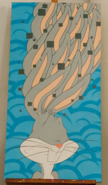
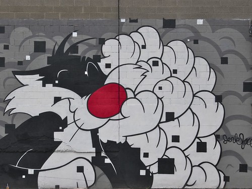
Three things are distinctly odd about these images, both by Jerkface – as you see, Bugs Bunny is on canvas; Sylvester is on a wall. Neither face has eyes, and both pictures appear to be “pierced” by a pattern of squares, and Bugs has multiple ears and Sylvester has multiple paws. Note that the pattern of squares doesn’t respect the distinction between foreground and background – well, in the Bugs Bunny it almost does, but it definitely doesn’t in the Sylvester.

Let’s start with the squares. As a comparison, let’s look at this graffiti piece:

IMGP0820rd.jpg

In typical fashion the name dominates the image. What interests me are those rectilinear forms walking over the surface. The name-form is bordered in orange and we orange rectilinears merging into that outline, with a few free of it. The blue and green rectilinears within the name-form work a bit differently. Some of them respect the letter-form boundaries, but some extend beneath those boundaries while others go over it.

The overall effect is similar to that of the square’s in the Jerkface images. In all three cases we’ve got to quasi-independent image “logics” that intersect one another in the image plane. One is figural – cartoon characters for Jerkface, a name for the graffiti piece – and the other is a relatively simple geometric pattern.

Tuesday, September 23, 2014

Jersey City Graffiti 2: Analysis

This is the second part of a three-part article. Part 1 is here. It was originally posted to New Savanna on Sept. 25, 2007.

Slum populations chilled on one side by the bleakness of modern design, and brain-cooked on the other by comic strips and TV ads with zooming letters, even brain-cooked by politicians whose ego is a virtue - I am here to help my nation - brained by the big beautiful numbers on the yard markers on football fields, by the whip of the capital letters in the names of products, and gut-picked by the sound of rock and roll screaming up into the voodoo of the firmament with the shriek of the performer’s insides coiling like neon letters in the blue satanic light, yes, all the excrescence of the highways and the fluorescent wonderlands of every Las Vegas sign frying through the Iowa and New Jersey night, all the stomach-tightening nitty-gritty of trying to learn how to spell was in the writing, every assault on the psyche as the trains came slamming in. 
– Norman Mailer, “The Faith of Graffiti

What’s in a Name

As we have seen, the graffs tradition is based on the name, a nick name that the graffiti writer chooses as his or her persona in the graffiti world. As I indicated in the previous section, tags are the simplest expression of the name. On the left in this photo we see the tag of a writer named Switch along with a crew tag, LNR:

switch LNR

Figure 26: Switch LNR

Throwies are a bit more developed. This railroad bridge is covered with tags and throwies (most of them in balloon-style letters):

tags and throwies on a railroad bridge.jpg

Figure 27: Tags and throwies on a railroad bridge

The most highly developed expression of the name is the piece. Pieces are written in two broadly defined style families. As far as I know the oldest family has no standard name, but the phrase “old school” is sometimes used when talking about them, so that’s the term I’ll use here. The letters in old school pieces are easily read by anyone; they may be highly ornamented, with drop shadows, coin-like edging, and patterned faces, but the forms are legible. When the so-called Wild Style emerged in the late seventies, the letters became elaborated in such a way that it was very difficult to read the name unless you already knew what it was. At this point the name seems to function primarily as an abstract framework upon which the writer crafts a design, much as blues musicians work endless variations on the same basic chord progression.

In the rest of this section I want to examine a few pieces. My purpose is not to give anything like a representative catalogue of styles. I simply want to make a few broad but useful distinctions.

Let’s begin with a very simple, readable, and subtle old school piece by Ceaze:

Ceaze, On Coles

Figure 28: Old School Ceaze

The letters are simple bold block letters with 3D extensions. The faces of the letters are lightly painted; in fact, it appears that the letter faces are not fully painted at all, but rather have patterns painted in them, as though Ceaze were eliciting the patterns from the concrete rather than painting them on it. Beyond this, it is not at all clear whether or not the forms in the letter faces represent an earlier layer of painting, Ceaze’s work on this piece, or a bit of both. To the extent that they a carry-overs from earlier painting, Ceaze has incorporated them into his own work.

ceaze-detail.jpg

Figure 29: Detail, Ceaze

Those patterns do not follow the logic of the letter forms, but rather “cut across” them in visual counterpoint (look at the first “E” and the “a”). The letter forms are outlined in hot pink and a light blue that contrast nicely with the neutral tones of the letters themselves. Finally, notice the “shines” and the references to his girlfriend Jen (at the top) and his crew, MSK, at the lower right (in the first photo). This piece has been weathered awhile, dulling the colors a bit. I don’t know how it would have looked when freshly painted.

Saturday, September 20, 2014

Graffiti Aesthetics 3: Stylistic Identity

This was originally published in The Valve on August 24, 2007.
I want to arrive at an approach to the question: What's the point of a writer painter his or her name if you can't read it? But I'm heading toward it slowly, indirectly. I want to begin by remounting the hobby horse I rode in my previous graffiti post, the need for accurate description.

I start with the assumption that the objects of interest – graffiti in this case, but it could be literary texts or musical compositions, for example – have an unbounded number of properties, only some of which are relevant to their aesthetic function. The most interesting properties are those which give them differential identity in the total field of objects in which they exist, the point that the early Structuralists made about phonological systems of natural languages. For example, while /l/ and /r/ sound different, that difference is not linguistically significant in all languages (e.g. Japanese). We cannot identify the relevant visual properties of graphs simply by examining isolated cases. We must consider them in relation to the whole field.
(As a side issue, I note that each object is created at a certain time and place in response to the field as it exists at that time. As more objects are created over time, the differential identity of each and every object in the field shifts as the field itself changes. This is a major source of the instability of meaning probed by deconstruction.)
Let us begin by considering another Ceaze, a very simple one:

Ceaze
Figure 1: CEAZE
Note: If you want to see a larger image, you can click on the image and thus be taken to my Flickr site, where I store these images online.
One of the most obvious characteristics of those letters is their angular and rectilinear form. The “C” is made without the standard curves and the “A” without sloping sides. Are those properties differentially significant, do they distinguish Ceaze's style from that of other writers? We can't tell by looking at this example. We need to consider other examples and compare them with the Cease. Here are two other examples:

cool-X.jpg
Figure 2: Themo
in the spirit of picasso?.jpg
Figure 3: unidentified
The first is by Themo (identified for me by Problems) and has the rough form of an “X.” There are many X-form pieces. I can't make out the letters in the second one and no one had identified the writer for me. The overall form, however, is asymmetric and irregular, which is what I'm interested in. Lots of grafs are like that as well - I think of them as crazy organics.

These pieces are quite different in overall form from the Ceaze. By noticing the differences we can begin to see which properties of the Ceaze have differential significance. That the name is readily intelligible is one of those differentiating properties. As we will see shortly, thought, it is a secondary one in this system of differential signification. The relevant differential properties are utterly banal: 1) the letters are aligned to the same horizontal line, 2) the letters have the same height, 3) the letters are of roughly equal width and 4) they do not interact with one another; they are contained within boundaries that cleanly separate them from one another. Neither of the two other grafs have these four properties; note in particular that their letter forms are deeply intertwined with one another.

Thursday, September 18, 2014

Graffiti Aesthetics 2: Learning to See

This originally appeared at The Valve on August 18, 2007. Upon re-reading it I rather like it. I'd forgotten I'd undertaken this kind of analytic and descriptive work. We need more of it.
It took me awhile to feel that I “comprehend” the more complex graffiti, the so-called “wild style” pieces where the letter forms are elaborated and extended so they are all but unrecognizable. It is not at all clear to me, however, just what is there for comprehension, hence the scare quotes. As far as I know, there has been little discussion about the logic and aesthetics of such pieces. The writers certainly know what they're doing in the way that all artists know what they're doing; but much of this knowledge is not explicit and analytic. It is intuitive and procedural.

I am not at all prepared to present a sophisticated analysis of such work. But I would like to ride one of my methodological hobby horses, the need for accurate description. Though it lacks theoretical pizzazz, description is important because it provides the verbal “handles” we use to “grab” an object and examine and manipulate it. We describe so that we can think. If our descriptions are poor, then our thinking will be inconsequential.

Old School and Wild Style

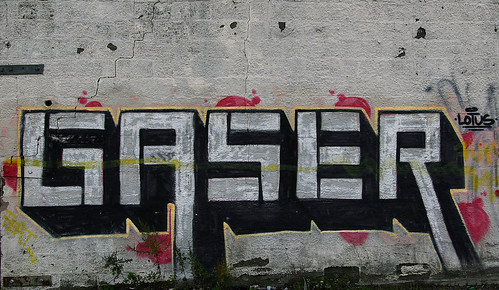
Let us begin with a simple old-school (not wild style) piece by Gaser (photographed on November 26, 2006):

Gaser
Note: If you want to see a larger image, you can click on the image and thus be taken to my Flickr site, where I store these images online.
Since description is at issue, let's begin with a basic description of the piece:
The letter-forms are simple block letters with 3D extensions. Notice that three of the letters - G S and R - ordinarily have curves in them, but Gaser has eliminated any curves in this version. He doesn't always do that, but he did it here. (This is, of course, common enough in display fonts.) Note also the downward extension of the “A” and the “R.” The name form is outlined by a narrow yellow stripe and set off against relatively small red “clouds,” as they are called - common practice. Notice “LOTUS” written at the upper right. I don't know whether that's a crew, a girlfriend - real possibilities, or something else. The letters stand man-high off the ground, about six feet.

Finally, the yellow stripe across the middle appears to be a “slash” (mark of disrespect) by another writer. This Gaser piece is next to another piece of similar size and style that has been extensively slashed, though not completely “gone over.”
That description is about as straight-forward as it gets. Note, however, that it only really works if you've seen the photograph or the piece itself. Without the photograph, for example, the description doesn't really tell you much about the letter forms. It doesn't tell you that they are all of the same height, except for the downward extensions on the “A” and the “R,” though you might make that assumption based on your knowledge of standard letter forms. Nor does my description tell you about the black lines in each of the letter forms. Nor does it tell you the angle and depth of the 3D extensions. And so forth.

It would, of course, be possible to describe many of those things. But the description would be a long one. Describing visual forms is difficult; hence the saying, “a picture's worth a thousand words.” If all graffiti was like that Gaser, the point would be fussy and pedantic. Most of the pieces I've photographed, however, are not that straightforward. They are far more resistant to such easy description. The forms in them do not have common names that we can use in describing them.

Here's a more recent Gaser. I photographed it on August 8, 2007, but it wasn't there the previous time I'd visited the site, August 1.

gazer red and purple.jpg

This is wild style. To be sure, the forms are compact and regular. But the letter forms are not immediately apparent. That's wild style, a very general concept that covers a great deal of stylistic territory.

Wednesday, September 17, 2014

Graffiti Aesthetics: Five Easy Pieces

First published at The Valve in 2007.
Even as Tim Burke had been calling for explicit and focused aesthetic commentary on popular culture, I was thinking of making a few aesthetic observations about the graffiti which I've been documenting since 2006 (cf. Shrine of the Triceratops). As some of you know, this kind of graffiti is based on the name; the graffiti writer paints his or her name, sometimes simply as a tag, sometimes a bit more elaborately as a throw-up or throwie, and sometimes in an often highly elaborated form known as a piece (for “masterpiece”). When the so-called Wild Style emerged in the late seventies, the letters became elaborated in such a way that it was very difficult to read the name unless you already knew what it was. At this point the name seems to function primarily as an abstract framework upon which the writer crafts a design, much as blues musicians work endless variations on the same basic chord progression.

Let's begin with a very simple, and readable, piece by Ceaze:

Ceaze, On Coles

Note: If you want to see a larger image, you can click on the image and thus be taken to my Flickr site, where I store these images online. 
The letters are simple bold block letters with 3D extensions. The faces of the letters are lightly painted in patterns which do not follow the logic of the letter forms, but rather “cut across” it in visual counterpoint (look at the first “E” and the “a”). The letter forms are outlined in hot pink and a light blue that contrast nicely with the neutral tones of the letters themselves. Finally, notice the “sparkles” and the reference to his girlfriend Jen (at the top) and his crew, MSK, at the lower right.

This piece has been weathered for a few years, which probably has dulled the colors a bit. I don't know how it would have looked when freshly painted. A few months after I took that photo Ceaze painted over it with another piece, in a more elaborated style.

But not as elaborate as we see here:

Ceaze Green

This was painted in 2005 (look at the lower right) and seems to me an example of the kind of baroque over-elaboration to which the style is prone. If you know the name, you should have relatively little trouble making it out, otherwise you may be mystified. But that is, at best, a secondary or tertiary issue. What I find bothersome is that the image lacks an overall visual form or focus. It is just a fussy mass of detail: grey, green, red, blue, and yellow. I'm sure there's a logic to it all, that it took care and skill to work it out, but I do not find the result very compelling.

Tuesday, September 16, 2014

Throw It All Away: American Heartache Sick of Society

20140915-IMGP0416 V4

It started with an email to Jon Naar: Let’s meet. Naar, as you may recall, did the first book on graffiti. He took the photos back in '72, found a publisher, and his publisher coupled him with a writer, Norman Mailer. Cay 161 gave Mailer a truth, “the name is the faith of graffiti,” and from that truth a book title was born: The Faith of Graffiti. The book went on to become the “bible” of graffiti.

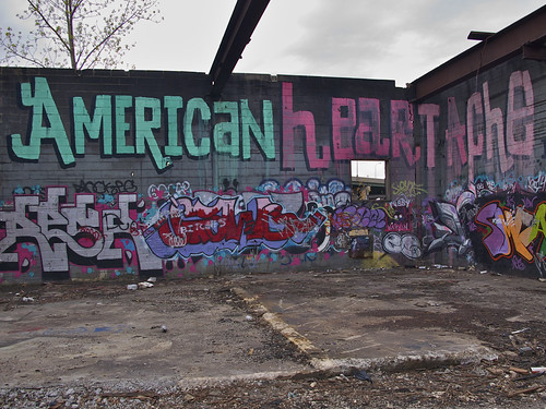
In his reply, Naar copied graff writer EKG. In my reply to both, I told them about American Heartache, a nice sized roller in an abandoned building in Jersey City:

IMGP6464

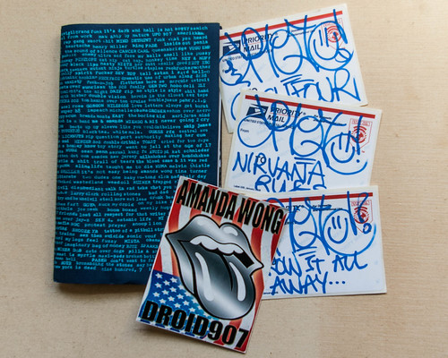
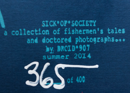
EKG says, that was by Droid907, I’ll let him know. Thus it was that I got an email from Droid907 asking for a mailing address so he could send me his latest book. A day or two ago the book arrived in the mail: Sick of Society, a collection of fisherman’s tales and doctored photographs. And with it, three stickers and a decal:

20140915-IMGP0379 V4

20140915-IMGP0428 V4

Zines have been around at least since Plato. That’s not what they called them in ancient days, but that’s what they were, artisanal books, hand crafted and NOT hot off the presses. There were no presses back then, just scribes, writing away, one at a time. Zines aren’t scribal, but you know a human hand touched each page.
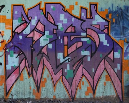
Saturday, August 23, 2014

EKG @ Graffuturism: Degree Oblivion (an autobiographic theoretical essay) [abridged]

EKG states the case:
the passion drive output strategy and remnants of an artist’s street actions schematize, render and broadcast a portrait of the artist’s identity and personality. choosing to use illegal aesthetic manifestations as a means of transmission imbues the artists statement with the aura of rebellion and revolution, inherently defining them as anti-status quo marks, ironically defined by the very structures and mechanisms that deny and censor them, the dominant class evident metaphorically in every detail of the architecture and infrastructure of any urban space, but individuals are the heart of all cities, semiotic bootleggers, values and transactions defined by individualistic human motives, love affairs and communities connected, alternative distribution channels, a mutant frequency, an underground wavelength, an under-cover-of-dark methodology protocols operations algorithms, each illegal aesthetic action creating a meta-tag, a link to an identity, another philosophy, another universe of singular depth and horizon, a data flux across aetherial transcircuitry, through arterial architecture, these signs of creation and signifiers of life decoordinate and re-systematize en masse representing the pulse of the city as a grid of many intersecting matrices, the heartbeat of the city, the voice of the populace, the will of the people
Let if flow….

Saturday, August 16, 2014

Everyone Poops: Graffiti on the Psychoanalytic Tip

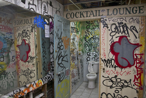
Take a quick look at this photo and then close your eyes and think about it a bit:

IMGP1208rd

I’m guessing that your overall impression is that it’s a mess, just a lot of visual crap. If you are of a psychoanalytic cast of mind, you might even think it rather anal expulsive. And then you might notice that hey! there’s a toilet there, or perhaps you have to take another look and focus a bit to see it amid all the, you know, crap.

Holy crap! you’re thinking, I was right. Anal as hell.

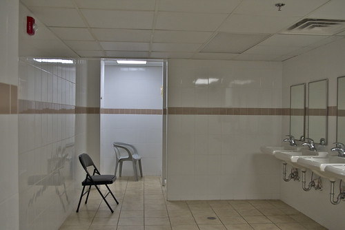
And then you might wonder how and why that particular bathroom got to be such a mess. After all, that’s not how bathrooms are in our culture. We like them clean and neat, like this one in a men’s rooming house:

IMGP7243

The Underground

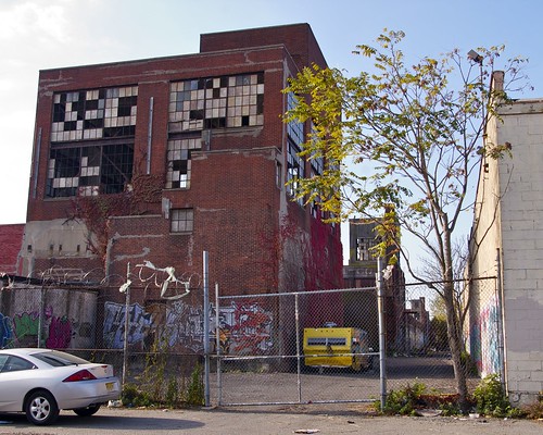
Well, that first bathroom, I assure you, is not in a men’s rooming house, though a few guys do make their home in that space from time to time. It’s in an old industrial building – used to belong to Clorox – in a second or third tier neighborhood in Jersey City. It’s part of a 5000 sq. ft. suite that’s used as an event space for an underground cultural scene. That’s the building there to the left, though this particular suite is at the other end:

IMGP4419

We’re looking into the alley behind the building. Though you can’t quite see it, the walls of the alley are lined with graffiti from one end to the other. Here’s the entrance hall to the suite: