 |
| Figure 1: Concentrics |
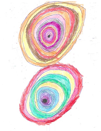
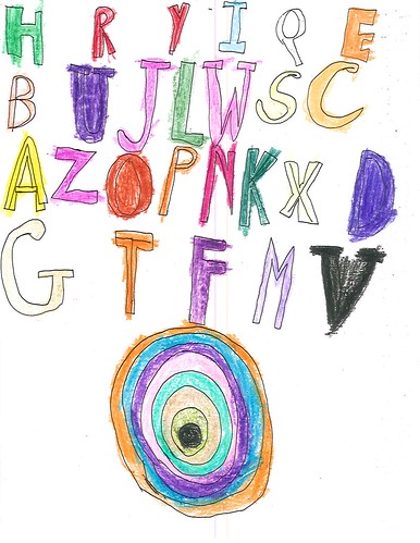
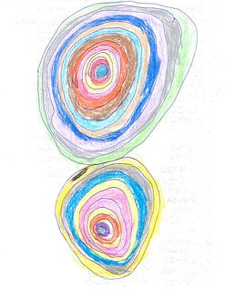
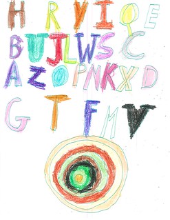
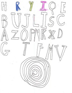
Let’s look at two closely related sets of sheets. One of them consists of concentric circles that have been colored-in, almost target fashion (Figure 1). With one exception they all have two sets of concentric circles. The two sets touch one another and they’re always arranged one set above the other, never side-by-side. Michael calls them swirls while his wife, Janet, and older son, Nick, call them jawbreakers. I’ll just call them concentrics. The other sheets consider of a set of concentric circles below and three or four rows of alphabetic circles above (Figure 2).
 |
| Figure 2: Letters & Concentrics |
To be honest, I don’t find these images as attractive as the dots or the towers, but that’s irrelevant. What is important is why Jamie likes to draw these sheets. As in the cases of the dots and the towers, I base my conjectures on the visual properties of the images themselves and the problems involved in drawing them.
* * * * *
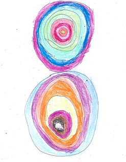
Let’s consider the concentrics first. In the next two examples, the two sets of circles are of roughly the same size. In Figure 3 they take the full height of the sheet while in Figure 4 they are confined to roughly the top half of the sheet.
 |
| Figure 3: Full-height concentrics |
 |
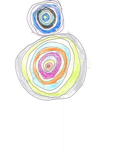
| Figure 4: Half-height concentrics |
How does Jamie draw these sheets? That’s question about composition. How does he ensure that the two sets of concentric circles are of roughly the same size –assuming, for the moment, that he is trying to achieve that result? That question is about technique. The assumption is reasonable given that most, though not all, of the concentrics consist of two circle sets of roughly the same size (I discuss this in more detail below).
In the case of the dot sheets Jamie seems to be interested in covering the sheet with dots. Sometimes he covers most of the sheet, sometimes he doesn’t. Judging from how the sheets look – I’ve not seen Jamie draw, nor have I asked Michael about this -– he appears to start along one edge and create row after row (if he starts from the top) or column after column (if he starts from one side). As long as Jamie keeps the dots roughly the same size and roughly the same distance apart, he’ll cover all or a large part of a sheet with a relatively uniform array of dots. Here’s the crucial point: he doesn’t have to do much, if any planning, to produce a good result.
The same is true for the towers of color. He starts at the right or left edge of the paper and draws one tower after another, coloring them as he goes along. He aligns the first tower with the nearest edge and the each successive tower with the one before. If the session is long enough he’ll cover the sheet from one side to the other. This doesn’t happen often and no examples have been posted online. Otherwise, the sheet will only be partially covered.
Let us call these two procedures local procedures. Why? Because Jamie can guide each individual drawing step with reference to something near by. He can’t do that with the concentrics. He needs a global procedure.
If you want to draw a large circle on a sheet so that it is equidistant from the right and left edges you have to attend to those edges while you are drawing your circle. That strikes me as being a bit trickier than following an edge while attending to the local visual environment, as with the dots and towers. Here Jamie has to direct his attention away from the path he is actually tracing with his pen and judge its relationship to one or the other edge. Moreover, when I examine the images with some care, it appears to me that he draws the circles with a single continuous stroke. That is not easy to do, especially for someone having problems with small-scale motor control; getting the ends to meet smoothly is particularly tricky.
If I had to do it, frankly, I’d prefer to use drawing instruments. I’d tape the sheet to a drawing board and then draw a straight vertical guideline down the middle of the sheet. Then I’d determine the center points for the sets of concentric circles and draw the circles with a compass. Could I do it freehand? Sure. But I’d prefer using instruments, especially if it was a subject I wanted to explore time and again.
Moreover, Jamie has to draw a series concentric series, either one inside another (assuming that he starts with the outside circle, which I am doing), or one around another (if he starts with the innermost circle first). To draw one circle in relation to another, you’ve got track the line you’re drawing in relation to circle serving as your guide. Tracking a round guide strikes me as being trickier than tracking a straight one. [If you use drawing instruments, you don’t have to track at all. Just reset the compass to a new radius and draw another circle. The proper ‘tracking’ is ‘build-in’ to the instrumentality of the situation.]
This motif, then, presents problems of composition and motor control that would make it challenging, and therefore interesting, to Jamie.
Consider Figures 5 and 6:
 |
| Figure 5: Concentrics, asymmetric |
 |
| Figure 6: Concentrics, asymmetric |
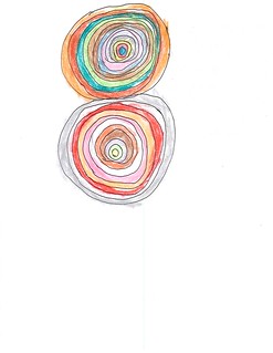
Here the two sets of concentric circles are of different sizes. Is that deliberate or do these sheets represent a failure to solve the composition problem? I do not know. But if you look at all the examples Michael has posted, these asymmetric ones are in the minority. There are 41 on the page, including one that has three sets of concentrics. I’ve gathered thumbnails of each into two composite images, Figures 7 and 8:
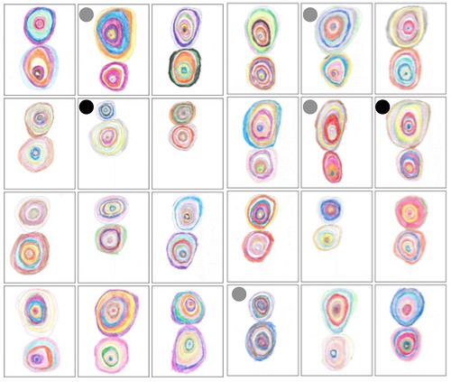 |
| Figure 7: Concentrics, panel 1 |
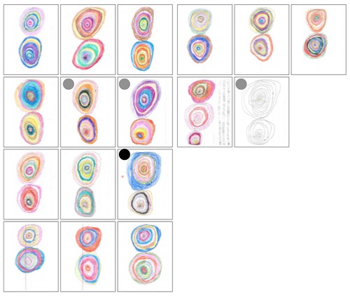 |
| Figure 8: Concentrics, panel 2 |
Where I judge a pair of concentrics to be roughly the same size, I’ve left the thumbnail unmarked. Where I see moderate asymmetry I’ve put a gray dot in the upper left corner; extreme symmetry gets a black dot. I’ve made these comparisons informally, simply by ‘eyeballing’ the images; I’ve made no attempt at formal measurement. Finally, I’m excluding the sheet with three sets of concentrics, but including the one that is uncolored, both in Figure 8. That gives us forty sheets.
I count 7 moderately asymmetrical sheets and 3 extremely asymmetrical ones. That gives us 10 asymmetrical sheets out of 40, or 25%. A large majority of the sheets thus have a symmetrical arrangement of concentrics: they are vertically symmetrical with respect to the boundary between the pair of concentrics. That the asymmetrical sheets are in the minority does not, of course, imply that Jamie did not intend those sheets to be that way. I note, however, that asymmetry is a natural consequence of misjudging the composition problem, and that such misjudgment is easy–which is why I’d prefer to use drawing instruments if I were making such images myself. In any event, if Jamie was deliberately intending asymmetry, well that too presents a composition problem, but one that’s slightly different from symmetrical composition. In either case, composition is at issue.
What about color? you ask. Jamie colors adjacent bands with different colors. That’s consistent with his practice on dots and towers. What’s interesting is to compare the way he colors the two concentrics on a page. The outermost bands never have the same color (not even third from the left in the bottom row of Figure 7, though you need to look at the full-size image to see that clearly). Beyond that, sometimes he uses similar colors in the two concentrics, sometimes he doesn’t. He’s clearly playing around, but it’s not evident that he has any explicit scheme to guide his variations. The number of things Jamie could possibly do is quite large, so large that undertaking systematic investigation of the entire space would exhaust anyone’s capacities. He executes each sheet with thought and deliberation and he tries different color schemes, obviously, because doing so is interesting. But he doesn’t have any overall scheme.
* * * * *
Let’s shift our attention to the sheets containing a set of concentric circles along with a list of letters, such as Figure 2 above. Here’s what Michael says about them:
The sequence of letters is most often HRYIQEBUJLWSCAZOPNKXDGTFMV, though, as you can see, there are some subtle variations. In rows four through eight, there is an even more rigid pattern:HRYIQEBUJLWSCAZOPNKXDGTFMVWe have no idea why Jamie reordered the alphabet this way, and he’s not telling. (He sometimes smiles wryly, sometimes shrugs.) All we know is that, probably due to the influence of his brother’s talent for calligraphy and design, he sometimes fills in the U, D, O, and V. In many of these–though not all–the concluding V is black and emphatic, almost as if it is driving a spike into the page to end the sequence.And then there is a jawbreaker.
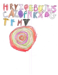
Figure 2 and Figure 9 (below) both have that more rigid pattern of letters arranged in four rows. I claim no insight into the sequence. I note that by settling on one or a small number of schemes and using them over and over, Jamie doesn’t have to think about what letter comes next. Perhaps the sequence follows some logic that’s obvious to Jamie, and perhaps it doesn’t. Either way, Jamie simply repeats it for each image.
 |
| Figure 9: Letters & Concentrics |
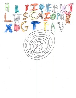
Figures 10 and 11 (below) have the letters arranged in three, rather than four, rows, and have the concentric placed more or less in the center of the page. I’ve included Figures 12 and 13 (below) as examples where the outlines have not been fully colored. As with the paired concentrics, the challenge seems primarily one of composition. Now Jamie has to arrange the letters in relation to one another and in relation to the concentric. Where the concentric is more or less in the middle of the page, he arranges the letters in three rows. When he puts the letters in four rows, the concentric is closer to the bottom of the page. Some sheets are better composed than others.
 |
| Figure 10: Letters & Concentrics |
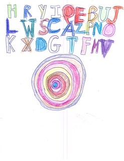 |
Figure 11: Letters & Concentrics
|
 |
| Figure 12: Letters & Concentrics |
 |
| Figure 13: Letters & Concentrics |
Finally, let’s take a closer look at the letters. The coloring is in crayon while the outlines are in pen, his general practice. And the coloring frequently strays beyond the outlines, as is common in the towers. But there’s something else going on here and there. Look at Figure 14:
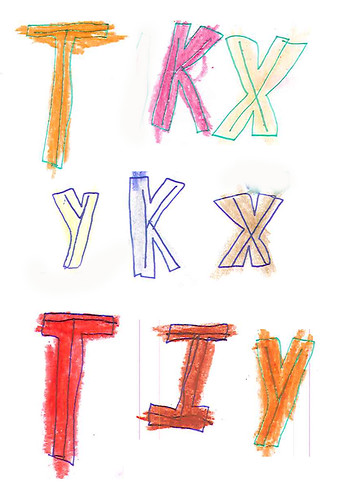 |
| Figure 14: Letterforms |
I took these letters from four different sheets. We’ve got nine tokens over five types: T K X Y and I. If you look closely at each letterform you’ll see that Jamie has drawn single lines inside each form. He may have done so with other letters (I just spotted it on an “M” and an “A”). I’ve not made an exhaustive check, so I don’t know. But I’m pretty sure that he hasn’t done that with most of the letters. And he hasn’t done that with all tokens of those letters.
But why has he done it at all? I ask the question because we are going to see that kind of thing all over the place when we look at his geometrics.
No comments:
Post a Comment