 |
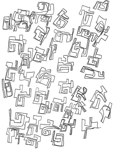
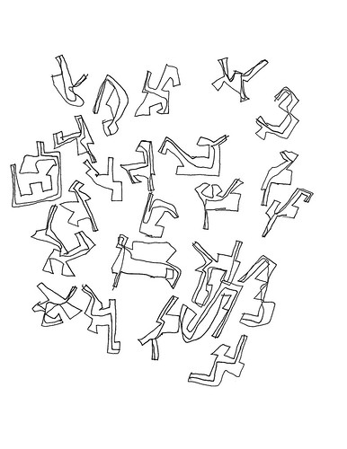
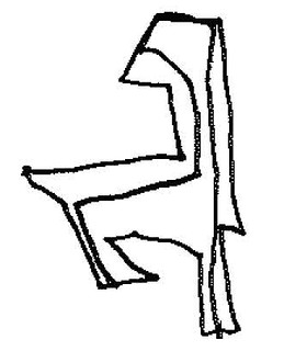
| Figure 1: Biomorphs |
Michael calls these images geometrics, and they are that, geometric. But, for reasons we’ll get to in a bit, I call them biomorphs. Here’s what he says about them:
Like Jamie’s fancy letters, probably influenced in part by the work of his brother the architect. But whatever their provenance, they are totally cool. I have included a few geometric drawings he did in crayon, but overwhelmingly this series is monochrome, usually in black but sometimes in red, blue, or orange.
After looking at these for awhile, see Figure 1, I decided they looked like tree branches and complex letterforms, so I emailed Mark Changizi, a theoretical neuroscientist who has done work on letterforms [1]. He has been making a general argument that culture re-purposes, harnesses (his term), perceptual capacities our ancestors developed for living in the natural world. One of his arguments is that the forms used in writing systems, whether Latinate or Chinese (for example), are those that happened to be useful in perceiving creatures in the natural world, such as plant and animal forms. I told him that Jamie’s forms looked like “tree branches and such.” He replied that they looked like people. His wife, an artist [2], thought so as well, and also: “This is like early human art.”
Which is to say, they appear to be biomorphic. Yes, these are geometric figures; but they’re special geometric figures. Well, “special” may not be the right word, but they’re not the relatively simple convex polygons–triangles, rectangles, pentangles, parallelograms, trapezoids, etc.–you study in a high school geometry class, at least not the class I took back in the Jurassic Era. Almost all of the individual figures–and perhaps all of them, I simply haven’t counted them up–are concave and all of them are “jointed” one or more times [3].
Let’s bring Michael into the discussion:
Oh, I agree that some forms are people-ish and creature-ish. But if you watch him at work (as I have, many times), it's almost like he's arranging forms on the page, not interlocking, but still talking to each other spatially. And some of them wind up looking like they have bodies, appendages, etc. And I totally agree that it feels interesting and evocative for him! The geometrics are his most recent form, dating over the last couple of years–
All of which is most interesting, especially the part about “arranging forms on the page.” For that’s composition, no? Getting his forms to “talk to each other spatially,” that’s more interesting, more sophisticated than what he was doing with the dots, the towers, and even the concentrics and letterforms.
Let’s look at some of the colored ones, with crayon fills:
 |
| Figure 2: Colored biomorph |
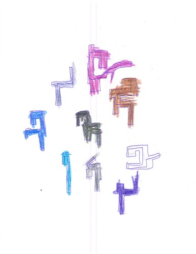 |
| Figure 3: Colored biomorph |
What’s interesting about those, and it seems typical of the color-filled ones, is that there are relatively few individual objects on a sheet, there’s more space between the objects than in the line-only ones, such as Figure 1, and they are nicely placed in roughly the center of the sheet, whereas the tendency with the lines-only sheets is to bunch the objects near the edges, as in Figures 4 and 5.
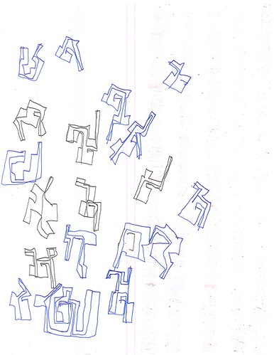 |
| Figure 4: Lines only (blue and green pens) |
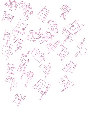 |
| Figure 5: Lines only (crimson pen) |
However, Jamie is not arranging the individual objects in parallel rows or columns. He’s more flexible. More dynamic, perhaps? And notice how these groups of objects seem to be moving up and to the right. He’s thinking about his arrangement in a way that’s different from the dots, towers, or concentrics and letters..
Two questions arise: 1) why did Jamie abandon colored fills for this category of imagery, and 2) why the distinctly different compositional style of those with colored fills? We know that, roughly speaking, the vision system has two broad divisions, one specialized for color, faces, and object identification and the other specialized for form, location, and motion. On the first question, it would seem that what interests Jamie most about this class of imagery is form, location, and motion. I don’t know what to say about the second question. Perhaps the compositional characteristics of these sheets – spacing and centered location – is purely adventitious; but I doubt it. In any case, Jamie is playing to one division of the visual system.
Consider Figure 6, where the individual graphic objects form a large cluster that is roughly centered on the sheet:
 |
| Figure 6: Centered biomorphs |
Notice also that there is more space between the individual figures than in Figure 1 above. As with the two sheets with colored fills (Figures 2 and 3), Jamie has composed his sheet in a way that does not ‘lean on’ edge following. That, presumably, is something he learned while doing the concentrics, and concentrics plus letterforms. But, it’s one thing to execute such a compositional scheme with concentric circles; it’s rather more sophisticated to do with independent figure that have no obvious ‘canonical’ orientation with respect to one another.
This strikes me as being a distinct advance in artistic technique and one that is more conceptual than physical. Drawing block letterforms is distinctly different from the single-stroke printing Jamie does in his lists. And arranging those letterforms in rows is different from printing words. Words are the units that make up his lists, and the letters are constituents of those words. In the concentrics&letterforms Jamie is treating the letterforms as individual and autonomous graphic objects which are to be composed into an appropriate scheme. His compositional scheme is simple, rows, and the spacing is frequently irregular. He seems more interested in the colors than in details of composition. But in Figure 6 he has no colors, just individual biomorphic objects, each more complex than a letterform. And his compositional scheme is decoupled from the horizontal grid.
Recall what Michael said about his process: “...it's almost like he's arranging forms on the page, not interlocking, but still talking to each other spatially.” Not almost. That is exactly what he’s doing. He’s arranging the individual forms with respect to one another while, at the same time, keeping the group as a whole well positioned on the page. He’s taken component skills – 1) drawing complex figures, 2) arranging individual objects together, 3) composing the page as a whole – and combined them into a higher-level process for creating, well, a work of art.
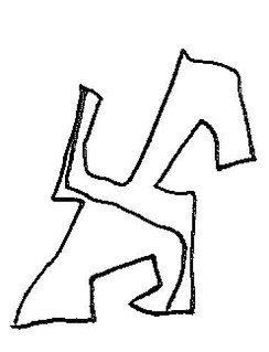
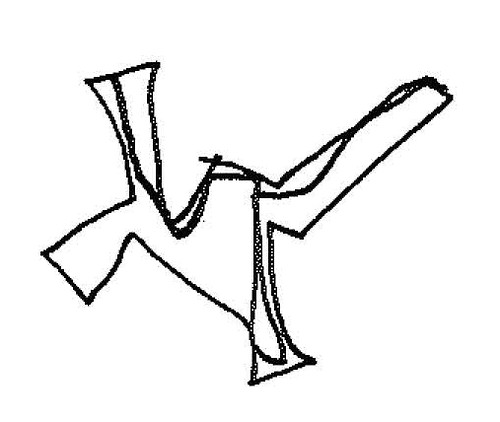
And now things get interesting. Figures 6a through 6e consist of individual graphic objects from Figure 6. What do they all have in common?
 |
| Figure 6a: Biomorphic object |
 |
| Figure 6b: Biomorphic object |
 |
| Figure 6c: Biomorphic object |
 |
| Figure 6d: Biomorphic object |
 |
| Figure 6e: Biomorphic object |
Yes, each is a convex polygon; each has several ‘limbs’. And each has a single interior line that goes from one side, through the interior space, to another side. The line never goes outside the polygon–well, yes, it does in 6e, but I suspect that’s a mistake. Why those lines? I don’t know what’s on Jamie’s mind as he draws those lines, but I’m guessing that he’s interested in the fact that, given the relative complexity of these figures and the variety among them, in every case he can draw such a line. In 6a the line is simple in relation to the figure, but in the others it takes a more complex route.
If I were a mathematician I’d find that interesting. Here we have distinctly different graphic objects that nonetheless share this funny property: you can tour the interior from one side to another and never exit the object. With respect to THAT property, whatever it is, these objects are all the same. By drawing those interior lines Jamie is, in effect, abstracting over those various different objects and discovering that they share a common identity.
To a topologist they are all Jordan curves [4]:
In topology, a Jordan curve is a non-self-intersecting continuous loop in the plane, and another name for a Jordan curve is a plane simple closed curve. The Jordan curve theorem asserts that every Jordan curve divides the plane into an "interior" region bounded by the curve and an "exterior" region containing all of the nearby and far away exterior points, so that any continuous path connecting a point of one region to a point of the other intersects with that loop somewhere.
Of course the simple convex polygons of high school geometry–triangles, rectangles, etc.–are Jordan curves as well, not to mention circles and ellipses. But the closed nature of those objects is obvious at a single glance. The closed nature of these more complex objects requires a more sophisticated mode of inspection, one guided by following a line that tours the object’s interior.
Does this make Jamie a topologist? No, not really. But it makes it clear that he’s an intelligent human being actively exploring and making sense of the world.
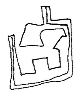
One last point. Where have we seen these interior lines before? That’s right, on his concentrics&letterform sheets, here and there:
 |
| Letterform Objects |
Addendum: See Charles Cameron's comments about the "heart line" in Native American art.
References
[1] Mark A. Changizi, Qiong Zhang, Hao Ye, and Shinsuke Shimojo, The Structures of Letters and Symbols throughout Human History Are Selected to Match Those Found in Objects in Natural Scenes, vol. 167, no. 5, The American Naturalist, May 2006
http://www.journals.uchicago.edu/doi/pdf/10.1086/502806
[2] Raheleh Bagheri, website: http://www.rahelehbagheri.com
[3] On convex and concave polygons: https://www.derivative.ca/wiki088/index.php?title=Convex_and_Concave_Polygons
[4] Wikipedia, Jordan curve theorem: https://en.wikipedia.org/wiki/Jordan_curve_theorem
No comments:
Post a Comment