When I started investigating Jamie Bérubé’s art I had no particular expectations, just a reasonable belief that it would be worthwhile. Now that I’ve examined each of his genres it is time to review the investigation. I want to begin with a quick overview of his aesthetic evolution, and then take up some details.
Jamie’s Evolution (so far)
We can divide Jamie’s work into roughly three phases: 1) Preliminary, 2) Compositions, and 3) Biomorphs. By Preliminary I mean Jamie’s early work, which we examined in On Discovering Jamie’s Principle. Jamie did this between 11 and 14 years old. In this phase the sheet of paper was simply where he made marks of various kinds. Jamie doesn’t have any conception of a sheet of paper as the locus of a particular ‘work’, if you will. Nor did he have any sense of overall composition; he simply placed objects wherever there was room, and, with the exception of some sheets of dots, different kinds of objects could exist on the same sheet.
In the second phase, which we examined in Investigations 1, 3, and 4, Jamie conceives of an individual sheet of paper as the locus for a coherent set of objects. First we examined his dots images, then towers of color, and finally (in a single post) pairs of concentric bands and rows of letterforms paired with a set of concentric bancs. In both the dots and towers schemes Jamie approached the problem of composition with a scheme he could execute with his attention focused on the local area where he is drawing. In the concentric schemes local attention is not sufficient. Jamie has to attend to all four edges when making his initial marks, some of which will not be near one or more edges.
Note that I haven’t observed Jamie drawing. My observations follow from the inherent logic of the drawing situation and take into consideration variations in the images themselves.
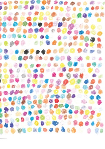
For a dots sheet Jamie can start at a top corner and then either move down the sheet, following the adjacent edge or move across the sheet following the top edge. Each successive dot goes next to the previous one; dots are of the same size and same distance apart. When he has finished one row Jamie can begin the next one, right next to the one he has just completed. Jamie continues drawing row after row until either the sheet if filled or until he otherwise stops (perhaps because he is interrupted).
This is Jamie’s simplest kind of drawing. The tower procedure is more complex. I note that we saw examples of dots sheets in his Preliminary phase and towers sheets as well, though the towers were horizontal rather than vertical.
While visually similar, a large number of more or less equally spaced color patches, the towers of color are more complex. For each tower Jamie 1) uses a pen to draw a tall slender rectangle, then 2) he crosses the rectangle with a large number of lines from one side of the rectangle to the other. The cross lines almost always extend beyond the original rectangle. Finally, 3) Jamie uses crayons to fill each cell with color, not bothering to stay strictly within the lines. Starting at either the left of the right edge, Jamie moves across the sheet until it is filled (or he is interrupted).
The two kinds of concentrics sheets are similar in that, in order to draw a set of concentric bands centered on the midline Jamie must attend to the left and right edges. Not having observed him draw I don’t know whether he draws the innermost circle first or the outmost; the latter makes more sense, though, as it make it easier to position the two sets of bands with respect to one another (in one case) or one sect with respect to the letterforms above and the edges left, right, and below. This is a more complex composition problem than Jamie faces with either the dots or the towers. Here Jamie has to conceive of the entire composition before he makes his first marks in a way that isn’t necessary for the dots and the towers. In those cases he has a local procedure which, if followed, will produce a good result. Jamie’s attention has to be more global for the concentrics.
On the whole was Jamie drawing dots sheets and towers sheets before the two types of concentrics sheets? In a sense the answer is yes, because we see such sheets in his early work. We see letterforms and concentric bands in the early work, but they are on sheets with various other graphic objects. We don’t see those compositional forms covering early-phase sheets. If we examined the distribution of sheet-types over the course of months and years, what would we see? What I’m wondering, of course, is whether or not the concentrics began to proliferate only has Jamie had gained confidence from drawing dots and towers. Michael notes, moreover, “He stopped making these towers a few years ago, but recently resumed them, much to our delight.” What’s up with that?
Finally, I have placed the biomorphs in a third phase (though I assume that he’s been doing other kinds of sheets even as he does these). For one thing, as I have noted before, Michael tells me these are his most recent type, “dating over the last couple of years.” Moreover, as I have argued in my post about them, these are more sophisticated than Jamie’s earlier schemes.
Biomorphic Complexity
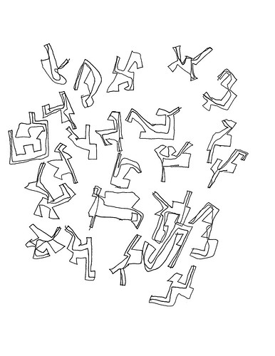
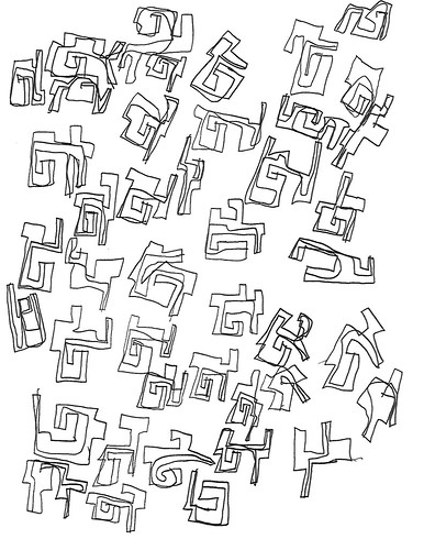
For one thing, the individual graphic elements are fairly complex. They are irregularly shaped; no two are alike (no, I’ve not checked, but this does seem to be the principle); and each of them has an interior line from one side to another. These objects are individualized in the way that letterforms are (notice that Jamie doesn’t repeat letterforms in the concentrics&letterform sheets). Each is its own little world.
Except for color, which we will get to in a moment, one dot is like another, one rectangular cell is like another, and one band is like another. Moreover, because of their irregular outline, these individualized objects cannot be arranged in a simple grid, like the dots and the towers. Local composition now requires specific thought in order to fit the objects next to one another.
Global composition becomes more interesting as well. For the most part Jamie seems to be intent on covering the sheet. But there are cases where Jamie has clearly placed a cluster of objects more or less in the middle of the sheet:
 |
| Figure 1: Centered biomorphs |
 |
| Figure 2: Centered biomorphs |
You cannot do that unless you attend to the entire sheet even as you draw the individual objects. Moreover, if I were to execute this kind of imagery I might well pencil-in a very light circle or ellipse to mark the boundary of my object cluster and then erase the mark when I’m done. Is Jamie imagining such a construction line as he draws?
What I’m wondering is whether or not these biomorphic sheets are not only more complex than the others, but more abstract as well. I’m thinking about Jean Piaget’s notion of reflective abstraction [1]. As you may know, Piaget argued that the mind develops through a series of stages, with later stages built on earlier ones. He is best known for making that argument with respect to ontogeny, childhood development. But he also looked at conceptual development at the scale of human history and found reflective abstraction operating there as well [2]. The idea is that the most sophisticated mental processes at one stage become subsumed by the processes at a higher stage and are now objects for manipulation and examination by that higher stage.
Is that what we are seeing in these biomorphic images? I don’t know, but the question is worth exploring. Note that I’m not so much thinking in terms of Piaget’s developmental stages, but simply in terms of how the mental processes required to create the biomorphic compositions relate to the mental processes involved in the other classes of imagery.
Color, Eye Movement, and Composition
What initially attracted me to Jamie’s art was the sense of rhythm in the dots and towers of color. And that rhythm was created by Jamie’s use of color. Moreover, we know that the visual nervous system handles color in a different system than form and location [3]. That is likely what we are seeing on when Jamie fails to color carefully between the lines, as he often does. For some purposes, it just doesn’t matter – note, though, that he is more careful about keeping within the lines in the concentrics. The color channel and the form channel do just fine as long as they are roughly correlated in space. Moreover, color perception is strongest in the center of the visual field, which is also specialized for high-resolution detail. Our ability to see detail across the entire visual field is due to the fact that our eyes are constantly scanning the world and, consequently, the visual mind is summing over those individual fixations [4].
With this in mind, let is return to Jamie’s dots sheets. You can create any image you want if you use a large enough number of colored dots. The pointillists discovered that; colored printing depends on it, as does analog and digital graphics. Even if you aren’t interested in representational art–Jamie isn’t–there are lots of patterns you can create with colored dots. While Jamie experimented a bit with stripes, he settled on apparently random arrangements like this one:
 |
| Figure 3: Dots |
As I pointed out in my first post, however, Jamie rarely places two dots of the same color next to one another–you see it in Figure 3 with some black dots and some yellow ones. His process is not random in a statistical sense. He’s avoiding clusters of same-color dots. As a result his dots images have a pleasing, if difficult to characterize, rhythm.
Is Jamie controlling that rhythm? Beyond simply avoiding clusters of same-color dots, is Jamie shaping that rhythm by how he places his colors? I do not know. And how would he do that? What would a statistical analysis of color distribution reveal? If we traced Jamie’s eye movements as he looked at Figure 3, where would he fixate? The yellows? What about the blacks? What about you and me, where would we fixate?
We can ask the same question of the towers of color. Even as he is for the most part avoiding local monochrome clusters, is Jamie regulating the overall distribution of color?
The concentrics images present different issues. There we have definite imagery and a more differentiated compositional field. But I’m still curious about Jamie’s use of color. Yes, Jamie avoids having adjacent bands of the same color, or adjacent letters. But there is more going on than that. What, if anything, does his choice of color in one set of concentrics allow us to predict about his use of color in the other set? What of his coloring of the letterforms?
The most interesting question to me, however, is that of color in the biomorphs. For the most part, he simply doesn’t use it. Why not? And why is it that when he uses color fills, those sheets have relatively biomorphs in them, and the biomorphs are nicely spaced in the center of the page? What would happen if he were to color all the biomorphs in a sheet that’s filled, such as Figure 4?
 |
| Figure 4: Biomorphs |
I think it would or could be very distracting. The nature of the shape is such that the color would have to somehow ‘mean’ something, but what? The problem disappears or is minimized when we see a small number of well-placed biomorphs. Why? Are we dealing with some neural expectation? How do we find out?
References
[1] Jean Piaget (1971). Biology and Knowledge: An Essay on the Relations between Organic Regulations and Cognitive Processes. Chicago, University of Chicago Press.
Jean Piaget (1976). The Grasp of Consciousness. Cambridge, MA, Harvard University Press
[2] Jean Piaget (1970). Genetic Epistemology. New York, Columbia University Press.
[3] I have no idea of what the best current introduction (technical or informal) to visual perception and neurophysiology might be, but I can refer you to some Jurassic literature. Richard Friedhoff and I included a review in Visualization: The Second Computer Revolution (Abrahams 1989). pp. 12-45. For a technical account see Margaret S. Livingstone and David H. Hubel, Psychophysical Evidence for Separate Channels for the Perception of Form, Color, Movement, and Depth, The Journal of Neuroscience, November 1987, 7(11): 3416-3468.
[4] Noton, D. & Stark, L. (1971). Scientific American 224(6), 34-43.
Yarbus, A. L. (1967) Eye Movements and Vision (trans. from Russian by B. Haigh; for American edition, L. A. Riggs), Plenum, New York. This is a classic piece of work that had enormous influence.
No comments:
Post a Comment