Another post from 2013, this one about one of my all-time favorites. I watched this many times as a child. It fascinated me on black-and-white TV. It entrances me in color.
* * * * *
The Nutcracker Suite episode in Walt Disney's Fantasia is one of my favorite episodes on film and, I believe, one of the most beautiful films ever made. Whatever beauty is, this film has got it. I've written about about its formal elegance, a ring form which is the same forwards as backwards. But that would mean little if it didn’t look good.
And it does look good.
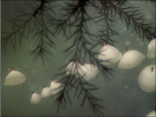
The following frame is, well, “typical” isn’t quite the word I want, perhaps “illustrative.” Yes, the following frame is illustrative:
It’s a close-up of pine needles during a snow fall. The twig is maybe two, three, four inches long. The whole segment consists of such close-ups: intimate observations of the natural world. But also, this frame is monochromatic. While The Nutcracker Suite episode of Fantasia displays a full palette, there are many sequences where the palette is subtle, rather than using highly-saturated “cartoony” colors. In this frame, it’s all blues.
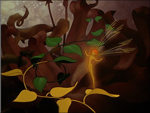
This next frame, in contrast, is in browns and greys, with some green and gold.
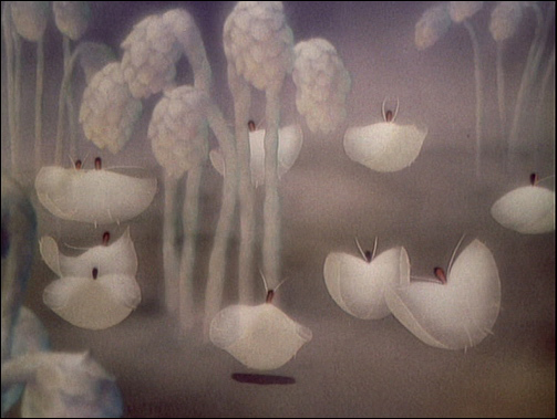
Here we see whites and grey-greens cut with green needles:
Of this “milkweed ballet” Disney said: “If you have a pod, and the fairies touch it, all the seeds fly out almost as if they’re alive . . . I think there’s something beautiful in those seeds ballet-ing through the air; I like to use them because we can get off the ground and have our ballet in air” (Culhane, p. 62). Their flight leads to another almost monochromatic scene:
Yet it’s not all muted tones. Here, for example, in the Cossak’s dance, we have highly saturated colors:
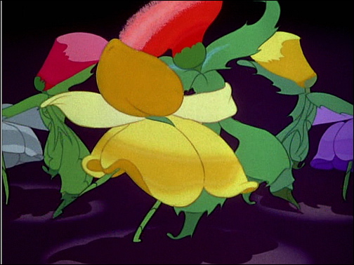
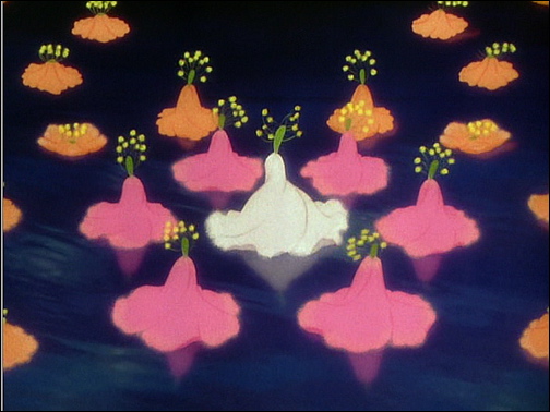
The colors are made even more dramatic by being set against a black background. These next flowers are colorful as well, and also set against a dark background:
Disney, and his designers, weren’t averse to highly saturated colors. But they didn’t want to depend on them. They deployed a full range of color designs in the Suite, from monochrome, through muted tones and neutrals, to the saturated and polychromatic. It is the range of effects that is important, that’s what lifts this episode above the ordinary, way above.
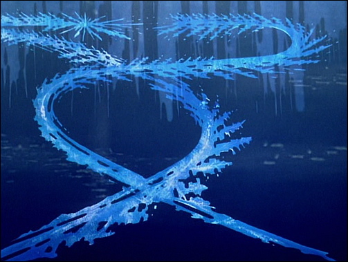
That flower image illustrates another aspect of the Suite, the effective use of symmetry. The frame shows simple symmetry about the vertical axis. Those flowers are moving, they’re ballerinas, so the symmetry shifts and changes. Here’s a rather different instance of vertical symmetry, tracks traced in ice:
What’s interesting about this frame is that it shows us motion – fairies skating on the ice – that has been projected into space – the planar surface of the ice. We see the fairies skate and, as they skate, the trail flows out behind them. Then we get a shot directly at those trails, allow us to “sum-up” the previous few seconds of motion in a single instantaneous image.
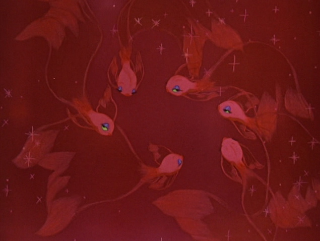
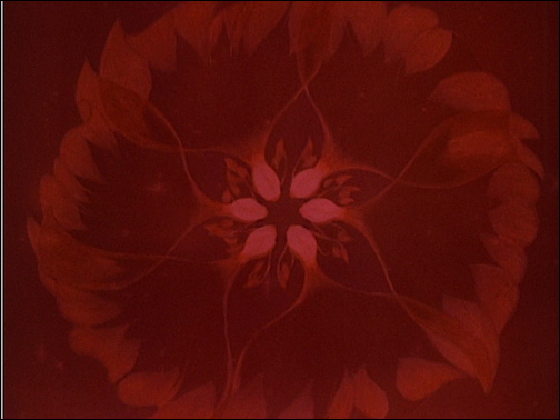
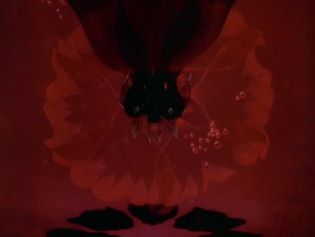
As they start moving inward you know something’s coming, but when they finally click the effect is stunning. All of a sudden they “become” a flower and that flower almost seems to pop out at you. And then it dissolves as they keep moving. Pure sensual delight, floating on a sexual subtext – for those fish are dancing with moves modeled on those of an exotic dancer Disney had brought into the studio.
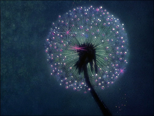
Then there’s the spherical symmetry of the dandelion, one of the loveliest images in the episode:
Two Notes
And then there is gender. Let me go out on a limb and say that this episode of Fantasia has always seemed a bit different from the rest. Just how to characterize that difference is not at all clear. Each episode establishes its own aesthetic universe and so there are many differences between them. But I’ll say that this episode seems more female than any of the others. If so, why?
While Disney employed many women in the studio, the “girls” who actually worked on the films did so as inkers and painters, not as designers, animators, or directors. These women worked behind the scenes and did not get screen credit for their work.
But The Nutcracker Suite was different. Three women are listed in the credits for this episode, Sylvia Moberly-Holland, Bianca Majolie, and Ethel Kulsar. Only one other woman is listed in the credits for Fantasia, Lorna S. Soderstrom for The Pastoral Symphony. Could Moberly-Holland, Majolie, and Kulsar and a decisive influence on The Nutcracker Suite? Culhane notes that they did the storyboard sketches – obviously a critical job – and that “they would pick weeds in vacant lots near the Studio and bring them in and drawn them up as dancers” (p. 46). Thus they were responsible for much of the research behind the imagery and for the overall flow of imagery (the storyboards). Those seem like central and broadly influential roles. Is it there work that differentiates this episode from all the others in Fantasia?
* * * * *
Disney showed The Nutcracker Suite on the television program, which I watched as a child. Even in black and white it was magical. I wonder whether or not those images affected how I saw the world. I know that, each spring, I anxiously awaited the first bloom of the daffodils, and later the lilacs. I chased fireflies, caught them, and put them in a jar; chased butterflies too. We all did those things, that’s what kids did in my neighborhood, which was suburban bordering on rural. And we all watched Disney. Could those televised images shaped our perceptions of the world around us?
John Culhane (1983/1999). Disney’s Fantasia. Harry N. Abrams.

No comments:
Post a Comment