Tuesday, September 30, 2014

Trust, Building, and a “Personal Learning Network”

PLN? What’s that?

“Personal learning network,” you say.

Well, OK, but it feels a bit like saying that my legs are my personal locomotion appendages. They ARE that, of course, but the locution is off-putting and I’m not sure what’s gained by it.

But then I’m likely in a somewhat different situation from most of the people hanging out in this Connected Courses floating seminar. Though I once had a university post, that was long ago, before the web, though not before the Internet. I’m an independent scholar, not completely by choice, but the independence means more than that I’m not on a faculty somewhere. I also means that I’m free to go boldly where none have gone before and THAT, as much as anything, is probably why I’m not on a faculty somewhere.

In any event, the emergence of the web afforded me an intellectual life I thought I’d never have. Mind you, it’s still far from ideal, but I can meet people and get the word out and do so more effectively than I could from within the academy.

I’ve already written two longish posts about my online publishing activities, so I’ll try not to repeat much of that here. Publishing is a way of participating in an intellectual community or communities and the online environment has made that easier, more varied, and more fluid.

My first venture onto the web happened in the 1990s when I hooked up with Bill Berry to work on an online community initially called Meanderings, after an occasional newsletter Bill wrote, and then called Gravity. We decided “new savanna” would make a good domain name, as humankind got started on the savannas of Africa and now cyberspace represented a new savanna. Bill has retained the name, the remains of our work still exist there, and I’ve used the name as the name of my blog, New Savanna (which is where we are now). That’s the center of my online world and has been for the last several years. That name thus represents real continuity in my online activities, a philosophical and personal continuity.

Gravity was conceived as a hangout for people interested in African-American culture. We published monthly articles by members of the community, did collaborative coverage of the O. J. Simpson trial with Vibe Magazine, and had an interactive discussion area that Bill coded up. The venture lasted two years before Bill had to go back to work. I see him around on Facebook (FB) and have kept in touch with other members of that community in various venues.

Just where is the mind located, anyhow?

We all know that it's in the head and, within the head, in the brain. Beyond that, though, things are a bit murky, as (modern neuroscience not withstanding) we don't know just what happens where in the brain. But it wasn't always obvious that the mind is in the head. Victor Mair has a fascinating post over at Language Log dealing with Chinese conceptions of the mind. He starts by quoting from The Atlantic:
Rather, I would like to concentrate on a problem raised in this key sentence from the section of the article titled "Decisions are made from the heart":
Americans tend to believe that humans are rational creatures who make decisions logically, using our brains. But in Chinese, the word for "mind" and "heart" are the same.
What can we say about this identification of "heart" and "mind" (xīn 心)? In what way is true? In what way is it misleading? 
Because of uncertainty over how to translate xīn 心, whether as "heart" or "mind", some scholars have taken to rendering it as "heart-mind" or "heart / mind", while others feel that it should be translated as "heart" or as "mind" depending upon the context. It becomes problematic when one insists on translating it either as "heart" or as "mind" in all cases.
He asked a number of experts about this and lists their replies, which are fascinating. Mair concludes:
So, we've covered a lot of ground in this inquiry, from the heart to the mind to thought and the mind-body problem. But where in all this is the self located? When it comes to the self, there was little hesitation among premodern Chinese in locating it in the nose. Indeed, the early forms of the graph for zì 自 ("self") depicted a nose.

My wife (and many other Chinese friends and acquaintances) actually emphatically pointed to her nose (placed the end of her index finger on the tip of her nose) when she would say, "Wǒ zìjǐ 我自己" ("I myself").

For traditional Chinese, the mind may have been in the heart, but the self was in the nose.

Monday, September 29, 2014

Dancing in the Streets: Hoboken 2014

20140928-IMGP1039

Yesterday was Hoboken’s Arts and Music Festival and a good time was certainly had by many. The good news is that there was dancing in the streets. The not-so-good news is that there wasn’t enough of it and, as I explained in this post, Children in Search of the Dance, about a different outdoor musical event, many kids were frustrated and confused. The music had them moving, but they didn’t quite know what to do.

At least a half dozen times, for example, these little girls would run into the dance area in front of the stage and then turn around a go back to the sidelines.

20140928-IMGP0943

They wanted to move, but didn’t quite know how or where.

Is Western Culture an Illusion?

I published this on The Valve in 2006, but as the following note indicates, it's older than that. It bears on the notion of evolutionary lineage in culture. Also, I've kept some notes at the end that come from the discussion at The Valve. The second set of notes is in response to a comment by John Emerson. The whole discussion over there is worth looking at.

Sometime between twenty and thirty years ago I was casually chatting with David Hays, friend, colleague, and mentor, and asked, “in what sense is American culture a kind of Western culture? What are the general features that mark a culture as Western and what special features distinguish American culture from other varieties of Western culture, say Canadian, or Italian, or Finnish?” He thought the questions rather peculiar, as did I. That's why I asked them.

An yet we talk about things like Western culture and African culture and Oriental culture and Mexican and Indonesian culture as though they are meaningful designations. We certainly endow them with a heavy burden of geopolitical meaning. But I'm not at all sure they're meaningful categories for cultural analysis. I rather suspect that, as they're currently used, they're useless; whether they can be made descriptively and analytically meaningful, I don't know.

My thinking on this issue is bound up with my efforts to understand the role of African American music in America's musical culture, but it has more general implications. Here's a short piece I first published to the web over a decade ago.


If African-American Music Isn't Western,
What is It
and Who are We?


Western culture began to fall apart on me when I decided to write about the impact of African-American musical culture on American music. It is clear that African-American music owes a substantial debt to Africa. It is also clear that African-American music has had a dominating influence on American music in general. By applying a familiar syllogistic mechanism to those propositions one can see that American music is indebted to Africa. That it is, in some measure, African. So far so good.

However, music is not an autonomous cultural process or product. It expresses the values, attitudes, and strategies of the society in which it functions. Thus behind the question of the relationship between African musical culture and American musical culture is the larger and more general question of the relationship between African culture and American culture. If, through African-American music, African music has been driving American music, then is it also the case the African culture has been driving American culture? And if that is the case, how far has the process gone? Given that African cultures are not Western cultures, has the process gone so far that American culture should no longer be considered Western? Just how much African culture can American culture absorb before it ceases to be fundamentally Western in nature?

Let us begin with the relatively concrete question of whether or not African-American music is Western music. Some authorities clearly think it is. Thus, in Music of the Common Tongue (1987), Christopher Small (p. 4) asserts that
...the Afro-American tradition is the major music of the west in the twentieth century, of far greater significance than those remnants of the great European classical tradition that are to be heard today in the concert halls and opera houses of the industrial world, east and west.
Small will go on to argue that African-American music carries values which are at odds with the dehumanizing industrial cast of European and American society and that those values are good and important. More recently, and from a more conservative location in the political universe, Marsha Bayles has also claimed Afro-American music for the West (Hole in Our Soul, 1994 p.22):
I realize that a great many musicians and writers will reject the proposition that Afro-American music is an idiom of Western music, on the grounds that it is, root and branch, totally "black," meaning African. This attitude is usually called "cultural nationalism," but I prefer to call it "cultural separatism," because, instead of Affirming Afro-American music by sharing it with the world, it takes a jealously proprietary stance.
Bayles will go on to argue that the virtues which African-American music has brought to the world are being threatened by decadence which began at the turn of the century and has become frightfully pervasive in our own time. Both recognize that African-American music is quite different from classical music and European folk musics in its devices and emotional tenor. But neither of them see this as a reason for thinking the music is not Western.

Of Marshmallows and Will-Power

Urist: I have to ask you about President Clinton and Tiger Woods, both mentioned in the book. I’ve heard of “decision fatigue”—are their respective media scandals both examples of adults who suffered from “willpower fatigue?” Men who could exercise enormous self-discipline on the golf course or in the Oval office but less so personally?

Mischel: No question. People experience willpower fatigue and plain old fatigue and exhaustion. What we do when we get tired is heavily influenced by the self-standards we develop and that in turn is strongly influenced by the models we have. Bill Clinton simply may have a different sense of entitlement: I worked hard all day, now I’m entitled to X, Y, or Z. Confusion about these kinds of behaviors [tremendous willpower in one situation, but not another] is erased when you realize self-control involves cognitive skills. You can have the skills and not use them. If your kid waits for the marshmallow, [then you know] she is able to do it. But if she doesn’t, you don’t know why. She may have decided she doesn’t want to.

Urist: So for adults and kids, self-control or the ability to delay gratification is like a muscle? You can choose to flex it or not?

Mischel: Yes, absolutely. That’s a perfectly reasonable analogy.

Urist: In the book, you advise parents if their child doesn’t pass the Marshmallow Test, ask them why they didn’t wait. What should I be trying to elicit from my son about why he grabbed the first little cupcake? When I asked, he just shrugged and said, “I don’t know.”

Mischel: It sounds like your son is very comfortable with cupcakes and not having any cupcake panics and I wish him a hearty appetite. Whether the information is relevant in a school setting depends on how the child is doing in the classroom. If he or she is doing well, who cares? But if the child is distracted or has problems regulating his own negative emotions, is constantly getting into trouble with others, and spoiling things for classmates, what you can take from my work and my book, is to use all the strategies I discuss—namely making “if-then” plans and practicing them. Having a whole set of procedures in place can help a child regulate what he is feeling or doing more carefully.

Sunday, September 28, 2014

You too can spot sprites in the sky for science

Armed with sensitive cameras and radio telescopes, Mr. Ashcraft hunts for sprites — majestic emanations of light that flash for an instant high above the thunderheads, appearing in the shapes of red glowing jellyfish, carrots, angels, broccoli, or mandrake roots with blue dangly tendrils. (Weather buffs call the tall, skinny ones “diet sprites.”) No two are alike.

And they are huge — tens of miles wide and 30 miles from top to bottom. But because they appear and vanish in a split-second, the naked eye tends to perceive them only as momentary flashes of light. It takes a high-speed camera to capture them in detail.

Depending on his skill and luck and the presence of storms, Mr. Ashcraft might get one or two sprite images a night, or more than 300. From June through August this year, he captured sprite images on 29 nights.

One of a growing corps of citizens who advance the scientific process in every field from astronomy to zoology, he sends his best images to Steven A. Cummer, a professor of electrical and computer engineering at Duke University who leads a multicenter project called Phocal, for Physical Origins of Coupling to the Upper Atmosphere by Lightning.

“We happily take images captured by anyone, either our own cameras or those of citizen scientists like Thomas Ashcraft,” Dr. Cummer said. A goal is to capture sprite images from multiple locations to triangulate their position relative to the lightning that creates them.

Float

20140825-IMGP9459

Ring Composition: Some Notes on a Particular Literary Morphology

Another working paper (title above). Links, abstract, etc., below.
 
Abstract: Ring-composition is an ancient way of ordering narratives, but it exists in a variety of modern texts as well. Mary Douglas has identified seven criteria for recognizing narrative rings: 1) exposition or prologue, 2) split into two halves, 3) parallel sections, 4) indicators to mark individual sections, 5) central loading. 6) rings within rings, and 7) closure at two levels. I analyze a variety of texts according to those criteria (“Kubla Khan,” Metropolis, Heart of Darkness, Apocalypse Now), introduce the notion of center point construction as a weakened, and therefor more general, form of ring composition, and discuss ring-composition in relation to a computational model of mental behavior.

Introduction: Rings and Narratives

I first learned about ring form composition in a 1976 article by R. G. Peterson, “Critical Calculations: Measure and Symmetry in Literature” (PMLA 91, 3: 367-375), which I probably read when it was originally published. By ring Peterson meant texts having this kind of form, often known as chiasmus:

A, B, … X … B’, A’
OR
A, B, … X, X’, … B’, A’
Peterson was reporting on a literature that was two decades old by that time, though it was mostly about classical and biblical texts. Beyond verifying the chiasmus in Dylan Thomas’ “Author’s Prologue”, however, I did nothing with the article. I simply filed the topic away in my mind.

I wasn’t until early in this millennium, after the publication of Beethoven’s Anvil, that I put ring composition on my own agenda. The late Mary Douglas had been kind enough to blurb the book and my editor put me in touch with her after it was published. In the course of our correspondence she asked me if I had any ideas about how the brain might do such a thing. She was interested in ring forms because she thought they were somehow fundamental to the human mind. Here’s an entry from my notes at the time:
The most interesting aspect of ring-composition is the inverse order requirement. Why do I think that? Because it places the most "stress" on the brain's equipment. Consider the alphabet. School children spend hours learning to recite the alphabet. But the fact that you've learned it doesn't mean that you can recite it in reverse order. That requires further practice. The brain's standard procedure for memorizing lists (whatever it is) is unidirectional. In contrast, once the alphabet has been written down, it is a trivial matter to read it in either direction. The eyes scan right to left as easily as left to right, bottom to top as easily as top to bottom.
So, just how is it that ring forms arise? It’s one thing to have a chiasmus that spans a short time period, such as that at the end of Shakespeare’s Sonnet 129 – “this the world well knows yet none knows well…” – but how do we do such a thing for a much longer span?

My initial thought, though, was that the navigation system might produce ring forms. Consider what happens when you leave home for some purpose at some other place and then return by the same route. For example, Mary goes to the grocer to buy a bottle of milk:
1) Mary leaves home.
2) She walks past the oak tree.
3) She walks past the post box.
4) She arrives at the grocery store.
5) She opens the door and enters.
6) She nods to the cashier.
7) She gets a bottle of milk from the cooler.
6’) She pays the cashier for the milk.
5’) She exits through the door.
4’) She walks away from the grocery store.
3’) She walks past the post box.
2’) She walks past the oak tree.
1’) Mary arrives home.
That’s a canonical ring form, with the departure from and arrival back home being the first and last elements in the ring and the purchase of the bottle of milk being the mid-point. The events in the tale are arrayed symmetrically about the mid-point.

Saturday, September 27, 2014

Present and Future

20140923-IMGP0731

Ontology in Perception and Thought

Yesterday I published Redefining the Coming Singularity – It’s not what you think, in which I speculated about the future of computing technology. Those speculations, however, were grounded in observations about cultural change in the past. In particular, I argued that there are 'singularities' in which an old 'ontology' gives way to a new one. This post from 2011 is about that sense of ontology, ontology as the basic framework of a conceptual system. My principle example is "salt" vs. "sodium chloride," which designate more or less the same substance, but a terms in different conceptual systems, different ontologies. Ontology in Knowledge Representation explains this more fully.
I have a long-standing interest in ontological thought, how we think about ontological matters: animal, vegetable, or mineral? As such I’m not directly interested in what really exists in the world, about the ‘ultimate constituents of reality’ – though my vague understanding is that object-oriented ontology (OOO) questions the ultimacy of some constituents over others – but simply how we think about things. That interest is one aspect of my general interest in the cognitive sciences and, in particular, knowledge representation.

Knowledge representation originates in the problem of programming computers to ‘reason’ about the world in a flexible way. It’s one thing to perform complex calculations given numerical data and the appropriate procedures. It’s a somewhat different thing to keep tabs on things and stuff, a parts inventory, the population of a country by region, state, county, and city, town, or village. But to reason about, say, medical diagnosis, or simply whether to take an umbrella with you when you go out for a walk, that’s more subtle. How do we model the knowledge required?

Those sort of questions are the background of my observations below. The point is simply that we’re talking about very explicit models of thought, models that can be programmed into computers. That’s a bit different from simply thinking about thinking, even in a reflective way. No you’ve got to get a machine to do a convincing job of mimicking thought.

Let’s start with a consideration of salt and sodium chloride, which I’ve excerpted and revised from an unpublished article, “Ontology in Knowledge Representation.” When we’re through that I’ll consider some implications of living with mutlple ontologies.

Of Salt and Sodium Chloride

We all know that salt and sodium chloride are, physically, pretty much the same. Conceptually they are very different. Salt is a white granular substance with a certain taste, and that taste is more salient in our understanding of salt than its appearance or texture. After all, the taste tells us of salt's presence even where there is no white granular substance to be seen or touched. Salt is thus rather adequately defined in terms of sensory perceptions.

Sodium chloride is a chemical compound whose molecules consist of one atom of sodium and one atom of chlorine. What in that definition is a sensory perception? "Compound," "atom," "molecule," these are all abstract. And if we start looking behind these abstractions one route will lead us to meter readings on laboratory instruments while another route will lead us to hadrons, leptons, and a handful of forces, strong, weak, electromagnetic, and gravitational, not to mention itty-bitty ‘strings’ in 9, 10, 11 dimensions. The conceptual domain in which we find "sodium chloride" is thus quite different from the one in which we find "salt." To borrow from the language of set theory, the extensions of those terms are much the same (note that salt ordinarily contains impurities which aren't in the extension of "sodium chloride") but their intensions are different.

Jersey City Graffiti 3: A Guide to Photos, Sites, and Links

This is the third part of a three-part article. Part 1 is here while Part 2 is here. I originally published it on Sept. 25, 2007 at The Valve. A lot has changed since then.


The Photographs

However inadequate photographs may be as documents for presenting graffs, they’re the documents I’ve got. All photographs are tricky beasts. Thus its no surprise that these photos of graffs present the standard challenges of medium and intention.

The most basic problem I’ve had with these photographs is “fixing” the colors when rendering them with the computer – I use Photoshop. The obvious choice, of course, is to get the colors to look like they were when you were actually there. But that appearance is only a memory. The lighting conditions on the screen and in the room where you work or view the images are quite different from those on-site. I have attempted to keep these images more or less within range of what you could actually see at the site.

These images also present a specific temptation. When newly painted the colors of graffs tend to be bright and their surfaces smooth and shiny. But they age quickly; the surface becomes dull and the colors faded. It is quite easy to brighten the images of aged graffs in Photoshop, perhaps even to something like they appeared when new. But how can you tell? No doubt I have succumbed to that temptation here and there, but not too egregiously.

There is another issue, that of intention. These photographs document the work of other artists. Ideally I should take a “neutral” or “transparent” stance in composing and framing my shots so that one sees only what the artist intended, with minimal interpretive interference from the photographer, i.e. me. I have taken and prepared many photographs in this vein.

But not all of them, not by any means. These are not easel paintings, created as self-contained aesthetic objects. These pieces exist out in the world where what happens to them is beyond the control of the artists or of museum curators. Some of them may be conceived in the spirit of easel paintings, first developed in sketches and then executed on whatever surface is available. But some of them – I have no idea of the percentage – will have been improvised on the spot, where the artist is susceptible to the immediate context. However they were conceived, whatever the artist’s intentions, graffs exist outdoors in contexts where their appearance changes according to time of day, season of the year, and current weather conditions. Their surfaces will degrade, as I’ve already mentioned, and others will come along and write over the topmost layer of imagery.

These things are important, and I have attempted to document them. I have taken many photographs where I am interested in documenting the context in which these graffs exist. The more image area I devote to surrounding context, the more choice I must exercise in choosing that context and framing the graffs within it. As I do this I am inevitably imposing circumstances on the graffs that are arbitrary with respect to whatever intention the writer may have had. In choosing those circumstances I am interpreting those graffs; I am taking what the world presents to me and using my craftsmanship to create order and meaning.

For example, when I photographed that rock-form AIDS graff (Figure 2) through the trees, I was interpreting the graff. To be sure, I did not create the trees, or the lighting, much less manipulate the graff itself. But I choose that particular shot, at that time of day, because I wanted to create a certain kind of image. I wanted to create the image of a mysterious structure hidden away in a lost world. Why did I want to create that image?

Because it casts the viewer in the role of an archaeologist investigating a strange but possibly quite wonderful civilization. That’s a useful perspective to take with you into the graff world. It reminds you that you are a stranger here, but it also prompts you to attend carefully to what you see, for it may be your best evidence about the lives of the people who made the images.

In this case, that last is not true. The writers are alive, most of them, though not necessarily available. Still, I believe that we should attend to their work as though it were all we will ever know about them. For I believe that their art will, in time, become ancestral to new schools and styles that we cannot now imagine.

stairway to heaven, no guitar

* * * * *

I keep my online photographs at Flickr, where my screen name is STC4blues. Flickr allows you to organize images into sets, and sets into collections. I’ve organized these images in three collections. The sets in the Sites collection are organized according to location, with one set for each different site. Each set in the Changes collection shows a single surface photographed at different times, with different graffs on it at thos times. The last collection, Categories, organizes set according to some analytic category. The graffs in these sets will not necessarily be at the same site, though in some cases they are.
The Sites

This satellite image from Google Earth shows the area I have been investigating:

graff-zone-jc & manhattan

That’s the Hudson River in the middle, with the route of the Holland Tunnel drawn on the river. You can see Washington Square Park in Greenwich Village new the right edge below the center. My graffiti sites are within the shaded area to the left. Note that these are not the only graffiti sites in Jersey City; there are others, but they aren't within easy walking distance of where I live and so I haven't investigated them.

Here is a closer look at that area:

graf-zone-marked-labled

Notice the diagonal green area in the middle-right of the image; that’s the edge of the Jersey Palisades. The land to the west (left) of that is roughly 80 to 100 feet above the lad to the east. I will say a bit about each area when I introduce the photos. All I want to do now is to associate names with areas on the map. The names are mind, but some of them are grounded in local usage. Starting from the west:
\BA – EC: Bergen Arches – Erie Cut
BR: Brunswick Tracks
CT: The Cut, but not the Erie Cut, though physically close to it.
YD: The Yard
SK8: Skate Park
S: Chocolate Factory, South
N: Chocolate Factory, North
JC: Jersey-Coles
HC: Holland Corridor
Pushpins:
Blue: Dickinson High School (up on the Heights overlooking downtown)
Green: Apartment building where I live
Red: Toll booths for Holland Tunnel
I currently have 21 sets organized by site (14 when I originally prepared this document). I'’ve listed only some of them below, along with some comments about each and a photograph or two.

Friday, September 26, 2014

Friday Fotos: The Revolution will Wear a Pink Dress

Last week I went out to Maker Faire 2014 to see Brave New Things, an exhibit on hardware hacking put together by my friend, Tiby Kantrowitz: "Crack apart, dissect, and deconstruct electrical devices in the junk drawers of your house, office, or car, mounnt them and see what you can build!" Here's some photos I took of one little girl as she hacked around. Look closely at the expressioins on her face.

20140920-IMGP0504

Brave New Things

20140920-IMGP0507

Hacking Hardware

20140920-IMGP0513

Deconstruction

20140920-IMGP0522

Thursday, September 25, 2014

Weaving Yourself through Fabric

Last weekend I went out to Queens to see my friend Tiby's exhibit of Brave New Things at Maker Faire 2014. I also saw a lot of strange things. And, on the way out, some wonderful pastel yarns and clothes, from Saori Weaving Arts Studio.

20140920-IMGP0583

"The SA of SAORI is the first syllable of the word SAI. SAI is found in Zen vocabulary. It means everything has its own individual dignity. And the ORI of SAORI means weaving."

20140920-IMGP0586

"In traditional hand weaving, weavers highly value the regularity and cleanness of the woven cloth: if there is an irregular pattern or thread, it is considered as a “mistake” or “flaw”. In SAORI, on the other hand, we put more importance on free expression, because hand weaving is different from machine weaving."

Wednesday, September 24, 2014

Why Teach? Obvious: to Change the World

20061122-IMGP0233

Why do I teach?

Well, I haven’t done so for years, except casually and by the by, and I didn’t much enjoy it when I was doing it?

So, why do you want to teach now?

That’s a story, not a long one, but a story. What it comes down to is there are things I want to do, things I want to see happen, and teaching is necessary to get there.

20061122-IMGP0234

I went into academia because I wanted to do research. Not only wanted to, but had a passion for it. There was a certain line of investigation I just had to follow. I was able to do that in graduate school, but things got difficult when I took an academic post.

It was a good school, but there really wasn’t much chance of teaching my research, it was just too far from the various courses I taught. So teaching became something that took my time and attention away from my research. That’s not good, neither for teaching nor research.

I didn’t get tenure and after trying for two years, was unable to secure another academic post. So I alternated between making a living at things of relatively little interest, and doing interesting, buy nonremunerative writing and research.

I left the academy thirty years ago. I’ve written a lot since them, as much as a third of half of it online in the last ten years. The research is in good shape, so it’s time to do a Faust and turn my attention to the world.

Jamming at Jadzia’s

I told my old buddy Dave Porush about last Saturday’s party at Jadzia’s International Emporium of Mystery and Conviviality and he said: “Building world peace one jam at a time!”

That’s about it. It was the event of the season, Farewell to Summer – Perry’s Birthday, and the folks were jammin’ ‘till the wee hours of the morning, though I had to leave early (writing deadline, dontcha’ know). There was the food of course, wonderful food, and people from all over, though I’m told that the contingent from Tajikistan couldn’t make it because their flux capacitors blew and the Martian shuttle couldn’t fly in replacements in time.

With all these people there was talk of many things, of shoes and ships and sealing wax, and the wisdom in Saturn’s rings.

And the music, that’s why I was there. I’ve known about Perry Robinson for years, but never heard him. And now I’d have a chance to jam with him, him and his Rastafarian buddies. What fun!

And it was. I didn’t know any of the musicians, except for the DJ, Lazarus Deuxx. It was a nice mix of young and not-so-young, men and women – but, alas, no children (too late at night I suppose), and all levels of expertise and experience.

That’s so important, you don’t know how. We’ve become besotted with expertise – and, yes, expertise is real, and important, but it’s not all. So there are the experts who are put off in a category beyond reach of mere mortals and mere mortals forget that they too are musical beings. That’s not good for us. We all need to embrace and be embraced by music, not merely through listening, but through the making.

And that’s how it was at Jadzia’s. As the night wore on Perry was holding court in the kitchen and outdoors on the deck, the Israeli bass player was feeding me horn lines, the chanting Rasta was cuing the keyboardist and Gerry was holding it down, while maintaining a cruising altitude of 35,000 feet mind you, on the djembe. Transcendental.

Jah Love!

We Are Music

Jay Schulkin and Greta B. Raglan
Frontiers in Neuroscience, 17 September 2014 | doi: 10.3389/fnins.2014.00292

Abstract: Music is a core human experience and generative processes reflect cognitive capabilities. Music is often functional because it is something that can promote human well-being by facilitating human contact, human meaning, and human imagination of possibilities, tying it to our social instincts. Cognitive systems also underlie musical performance and sensibilities. Music is one of those things that we do spontaneously, reflecting brain machinery linked to communicative functions, enlarged and diversified across a broad array of human activities. Music cuts across diverse cognitive capabilities and resources, including numeracy, language, and space perception. In the same way, music intersects with cultural boundaries, facilitating our “social self” by linking our shared experiences and intentions. This paper focuses on the intersection between the neuroscience of music, and human social functioning to illustrate the importance of music to human behaviors.

Tuesday, September 23, 2014

Jersey City Graffiti 2: Analysis

This is the second part of a three-part article. Part 1 is here. It was originally posted to New Savanna on Sept. 25, 2007.

Slum populations chilled on one side by the bleakness of modern design, and brain-cooked on the other by comic strips and TV ads with zooming letters, even brain-cooked by politicians whose ego is a virtue - I am here to help my nation - brained by the big beautiful numbers on the yard markers on football fields, by the whip of the capital letters in the names of products, and gut-picked by the sound of rock and roll screaming up into the voodoo of the firmament with the shriek of the performer’s insides coiling like neon letters in the blue satanic light, yes, all the excrescence of the highways and the fluorescent wonderlands of every Las Vegas sign frying through the Iowa and New Jersey night, all the stomach-tightening nitty-gritty of trying to learn how to spell was in the writing, every assault on the psyche as the trains came slamming in. 
– Norman Mailer, “The Faith of Graffiti

What’s in a Name

As we have seen, the graffs tradition is based on the name, a nick name that the graffiti writer chooses as his or her persona in the graffiti world. As I indicated in the previous section, tags are the simplest expression of the name. On the left in this photo we see the tag of a writer named Switch along with a crew tag, LNR:

switch LNR

Figure 26: Switch LNR

Throwies are a bit more developed. This railroad bridge is covered with tags and throwies (most of them in balloon-style letters):

tags and throwies on a railroad bridge.jpg

Figure 27: Tags and throwies on a railroad bridge

The most highly developed expression of the name is the piece. Pieces are written in two broadly defined style families. As far as I know the oldest family has no standard name, but the phrase “old school” is sometimes used when talking about them, so that’s the term I’ll use here. The letters in old school pieces are easily read by anyone; they may be highly ornamented, with drop shadows, coin-like edging, and patterned faces, but the forms are legible. When the so-called Wild Style emerged in the late seventies, the letters became elaborated in such a way that it was very difficult to read the name unless you already knew what it was. At this point the name seems to function primarily as an abstract framework upon which the writer crafts a design, much as blues musicians work endless variations on the same basic chord progression.

In the rest of this section I want to examine a few pieces. My purpose is not to give anything like a representative catalogue of styles. I simply want to make a few broad but useful distinctions.

Let’s begin with a very simple, readable, and subtle old school piece by Ceaze:

Ceaze, On Coles

Figure 28: Old School Ceaze

The letters are simple bold block letters with 3D extensions. The faces of the letters are lightly painted; in fact, it appears that the letter faces are not fully painted at all, but rather have patterns painted in them, as though Ceaze were eliciting the patterns from the concrete rather than painting them on it. Beyond this, it is not at all clear whether or not the forms in the letter faces represent an earlier layer of painting, Ceaze’s work on this piece, or a bit of both. To the extent that they a carry-overs from earlier painting, Ceaze has incorporated them into his own work.

ceaze-detail.jpg

Figure 29: Detail, Ceaze

Those patterns do not follow the logic of the letter forms, but rather “cut across” them in visual counterpoint (look at the first “E” and the “a”). The letter forms are outlined in hot pink and a light blue that contrast nicely with the neutral tones of the letters themselves. Finally, notice the “shines” and the references to his girlfriend Jen (at the top) and his crew, MSK, at the lower right (in the first photo). This piece has been weathered awhile, dulling the colors a bit. I don’t know how it would have looked when freshly painted.

Monday, September 22, 2014

The Direction of Cultural Evolution, Macroanalysis at 3 Quarks Daily

As soon as I finished up my series of posts about Matt Jockers, Macroanalysis: Digital Methods & Literary History, I set up a file on my Mac for further thoughts, knowing full well I’d keep thinking about the book. I’ve now posted the first of those continuing thoughts at 3 Quarks Daily: Macroanalysis and the Directional Evolution of Nineteenth Century English-Language Novels.

The issue is cultural evolution, a notion that Jockers flirts with, but rejects. Of course I’ve been committed to the idea for a long time and I’ve decided that his data, that is, the patterns he’s found in his data, constitute a very strong argument of conceptualizing literary history as an evolutionary phenomenon. That’s what my 3QD post is about, a fairly detailed (a handful of new visualizations) reanalysis of Jockers’ account of literary influence.

From Influence to Evolution

It is one thing to track influence among a handful of texts; that is the ordinary business of traditional literary history. You read the texts, look for similar passages and motifs, read correspondence and diaries by the authors, and so forth, and arrive at judgements about how the author of some later text was influenced by authors of earlier texts. It’s not practical to do that for over 3000 texts, most of which you’ve never read, nor has anyone read many or even most them in over 100 years.

Here, in brief, is what Jockers did: He assumed that, if Author X was influenced by Author Q, then X’s texts would be very similar to Q’s. Given the work he’d already done on stylistic and thematic features, it was easy for Jockers to combine those features into a single list comprising almost 600 features. With each text scored on all of those features it was then relatively easy for Jockers to calculate the similarity between texts and represent it in a directed graph where texts are represented by nodes and similarity by the edges between nodes. The length of the edge between two texts is proportional to their similarity.

Note, however, that when Jockers created the graph, he did not include all possible edges. With 3346 nodes in the graph, the full graph where each node is connected to all of the others would have contained millions of edges and been all but impossible to deal with. Jockers reasoned that only where a pair of books was highly similar could one reasonably conjecture and influence from the older to the newer. So he culled all edges below a certain threshold, leaving the final graph with only 165,770 edges (p. 163).

When Jockers visualized the graph (using Force Atlas 2 in the Gephi) he found, much to his delight, that the graph was laid out roughly in temporal order from left to right. And yet, as he points out, there is no date information in the data itself, only information about some 600 stylistic and thematic features of the novels. What I argue in my 3QD post is that that in itself is evidence that 19th century literary culture constitutes an evolutionary system. That’s what you would expect if literary change were an evolutionary process.

Cultural Evolution Has a Direction

What’s particularly striking, though, is that this change is clearly directional, a matter I examine closely in my post. Another way to characterize Jockers’ graph is this:
The literary system is evolving in a 600 dimensional feature matrix. As time unfolds, the links between highly similar books trace a diagonal through the matrix.
But why?

How It's Done, Part 4: The Completed Mural (GVM008)

20140914-IMGP0373 V4

20140914-IMGP0336 V4

20140914-IMGP0360 V4

Sunday, September 21, 2014

Jersey City Graffiti 1: The Story


This is the first part of a three-part series. It was originally posted at The Valve on Sept. 25, 2007.


I always tell people that if you want to know what’s going on with a city, look at the writing on the wall: you can tell what skill level and what social problems are happening, what’s going on with the youth.
– Toons, Los Angeles graffiti artist

Graffiti. Not graffiti in general, which has been painted and written since humankind first put markings on cliffs and in caves, but graffiti of a certain type that originated on the East Coast of the United States, particularly New York City and Philadelphia, during the late 1970s. This type of graffiti became associated hip hop culture, which also includes the music itself, with its DJs and MCs, the videos that go with that music, the various styles of break dancing, and certain fashion styles. As hip hop spread around the world, so did associated graffiti styles, though they've never become completely absorbed into hip-hop culture.

jj-elephunt.jpg

Figure 1: Mural, Jersey Avenue, Jersey City
Note: If you want to see a larger image, you can click on the image and thus be taken to my Flickr site, where I store these images online. 
That is as typical of the style as one could hope for in a single example, and that is why I chose it. The style is based on letters, specifically, the letters of the writer’s nickname. A “writer” is someone who paints graffiti. Reading the mural from left-to-right, we have DR. SEX (notice the downward sweep of the two R’s), Jersey Joe (the green creature), and HOUR. That elephant-like creature in the middle of this mural is called a character; such characters are often used as embellishments, though in some cases the embellishments may expand and take over.

This mural is about 50 yards from my apartment building, clearly visible from my front windows and from the street. Or it was visible; now it is painted over it in a medium light gray paint. Someone complained to the City and the City responded.

While I am interested in graffiti in general, I am writing specifically about examples within walking distance of my apartment. Much of what I say, however, is informed by general reports and discussions about graffiti  most of which are journalistic, even informal, rather than scholarly. I have no reason to think that my local sites are unique in any but a geographical sense. I’ve seen similar images in books and websites devoted to graffiti.

The Lay of the Land

I live in the Hamilton Park neighborhood of Jersey City, New Jersey, located on the West bank of the Hudson River across from lower Manhattan. This is a complex urban environment containing housing, small businesses, major roads, abandoned buildings and lots, and small concentrated patches of woodland and grassland. Think of it as an urban savanna in a temperate climate.

While exploring one site I sometimes feel like I’ve fallen into one of those jungle adventure movies at the point where the Intrepid Explorers first see signs of The Ancient Temple That Has Been Lost for Ages:

Lost Temple of Graffamundo in the Jersey Jungle.jpg

Figure 2: Lost Temple?

The letters to the left of center spell out “AIDS,” a graff crew that is quite active in the area. I have no idea whether or not there is any affiliation with an old Chicago crew writing under the same letters: Artists Inventing Def Styles. It should go without saying that these artists know quite well that “AIDS” is also the name for a chronic disease. Another locally active crew calls itself ADHD.

Less than a mile from that graff we come to the remains of an old chocolate factory – at least that’s what I’ve been told about the building:

MOK WERDS AIDS and Missle Launch Silos for the WAAGNFNP*

Figure 3: The old chocolate factory

Notice the remains of spent fireworks at the lower right. I don’t know when those fireworks were discharged, though July 4th is a plausible guess, but I took the photograph on October 31, 2006.

Saturday, September 20, 2014

Graffiti Aesthetics 3: Stylistic Identity

This was originally published in The Valve on August 24, 2007.
I want to arrive at an approach to the question: What's the point of a writer painter his or her name if you can't read it? But I'm heading toward it slowly, indirectly. I want to begin by remounting the hobby horse I rode in my previous graffiti post, the need for accurate description.

I start with the assumption that the objects of interest – graffiti in this case, but it could be literary texts or musical compositions, for example – have an unbounded number of properties, only some of which are relevant to their aesthetic function. The most interesting properties are those which give them differential identity in the total field of objects in which they exist, the point that the early Structuralists made about phonological systems of natural languages. For example, while /l/ and /r/ sound different, that difference is not linguistically significant in all languages (e.g. Japanese). We cannot identify the relevant visual properties of graphs simply by examining isolated cases. We must consider them in relation to the whole field.
(As a side issue, I note that each object is created at a certain time and place in response to the field as it exists at that time. As more objects are created over time, the differential identity of each and every object in the field shifts as the field itself changes. This is a major source of the instability of meaning probed by deconstruction.)
Let us begin by considering another Ceaze, a very simple one:

Ceaze
Figure 1: CEAZE
Note: If you want to see a larger image, you can click on the image and thus be taken to my Flickr site, where I store these images online.
One of the most obvious characteristics of those letters is their angular and rectilinear form. The “C” is made without the standard curves and the “A” without sloping sides. Are those properties differentially significant, do they distinguish Ceaze's style from that of other writers? We can't tell by looking at this example. We need to consider other examples and compare them with the Cease. Here are two other examples:

cool-X.jpg
Figure 2: Themo
in the spirit of picasso?.jpg
Figure 3: unidentified
The first is by Themo (identified for me by Problems) and has the rough form of an “X.” There are many X-form pieces. I can't make out the letters in the second one and no one had identified the writer for me. The overall form, however, is asymmetric and irregular, which is what I'm interested in. Lots of grafs are like that as well - I think of them as crazy organics.

These pieces are quite different in overall form from the Ceaze. By noticing the differences we can begin to see which properties of the Ceaze have differential significance. That the name is readily intelligible is one of those differentiating properties. As we will see shortly, thought, it is a secondary one in this system of differential signification. The relevant differential properties are utterly banal: 1) the letters are aligned to the same horizontal line, 2) the letters have the same height, 3) the letters are of roughly equal width and 4) they do not interact with one another; they are contained within boundaries that cleanly separate them from one another. Neither of the two other grafs have these four properties; note in particular that their letter forms are deeply intertwined with one another.

Friday, September 19, 2014

Did Indian Philosophy have an Early Modern Period?

Thus for example the early modern [European] philosopher who perhaps declared his independence from the past most loudly, Descartes, can be shown to have had a significant debt to Augustine, and this even in the work, the Meditations, in which he declares that it is his intention to proceed having forgotten everything he has learned up until this time.

In India, there is no such comparable expression of radical individualism. But Ganeri has compellingly shown that there is nonetheless a complex interplay between innovation and authority that mirrors the conciliatory syntheses going on simultaneously in Europe, even if the rhetoric of innovation is rather more subdued. In the Indian expression of this interplay there was, Ganeri emphasizes, no ‘quarrel of the ancients and the moderns’, that is, no radical rejection of the authority of tradition, nor any bold claim of the superiority of the present age. What there is, however, is a marked decline in deference to the ancients, and a parallel rise in calls to readers to think through philosophical problems themselves. Thus Ganeri cites the 16th century Nyāya philosopher Raghunātha Śiromaṇi, who insists that “these matters spoken of should not be cast aside without reflection just because they are contrary to accepted opinion” (4; Inquiry 1915: 79, 1-80, 3; trans. Potter 1957: 89-90).

One reason why the sort of call for independent thought that Raghunātha expresses here has generally been overlooked, or has not won for Indian philosophy in this period the appellation ‘modern’, is that most philosophers continued to write works of commentary. 
Later:
One very significant difference between European and Indian modern philosophy, also emphasized by Ganeri, is the fact that in the former case the shape that philosophy took, indeed the self-consciousness of philosophy as modern, was largely, or nearly entirely, a consequence of the emergence of modern science. There simply is no sense in thinking about modern European philosophy in general without thinking about the way it is shaped by such developments as the decline of geocentrism, the invention of the microscope, the development of key elements of what would later be called the ‘scientific method’, and so on. In India, by contrast, early modern philosophy continued to engage principally with questions of what we would call ‘epistemology’ and ‘philosophy of language’.
Thus, in Europe, the rise of science provoked a break from the past and we see the emergence of a new cultural rank. That didn't happen in India.

H/t, 3QD.

Five Friday Fotos: Shaky-Cam 3, Visions of the City

20140904-IMGP9793

20140904-IMGP9807

20140904-IMGP9802

Thursday, September 18, 2014

The Rise of the Rest

Pankaj Mishra reviews Niall Ferguson, Civilisation: The West and the Rest (2011) in the London Review of Books. Here's an excerpt:
Needless to say, most contemporary scholars of global history do not hold the West and the Rest in separate compartments. Far from developing endogenous advantages in splendid isolation from the Rest, Western Europe’s ‘industrious revolution’, which preceded the Industrial Revolution, depended, as Jan de Vries and other historians have shown, on artisanal industries in South and East Asia. Contrary to Ferguson’s Hegelian picture of stagnation and decline, China and Japan enjoyed buoyant trade and experienced a consumer boom as late as the 18th century. The pioneering work of the Japanese historian Hamashita Takeshi describes a pre-European Asia organised by China’s trans-state tributary network, demonstrating that there were many other centres of globalisation in the early modern world apart from those created by Western Europe. In The Birth of the Modern World 1780-1914, which synthesises much recent scholarship on the ‘extra-European origins of the modern European and American worlds’, C.A. Bayly shows that longstanding Chinese business clans were as important as bourgeois capitalists in Hamburg and New York in spreading world trade across South-East Asia. Ferguson should know some of this, since he endorsed Bayly’s book when it appeared as ‘a masterpiece’ that renders ‘parochial’ all other histories of the 19th century.

As in Ferguson’s other books, a vast bibliography trails the main text of Civilisation, signalling the diligent scholar rather than the populist simplifier. But he suppresses or ignores facts that complicate his picture of the West’s sui generis efflorescence. Arguing that the Scientific Revolution was ‘wholly Eurocentric’, he disregards contemporary scholarship about Muslim contributions to Western science, most recently summarised in George Saliba’s Islam and the Making of the European Renaissance. He prefers the hoary prejudice that Muslim clerics began to shut down rational thought in their societies at the end of the 11th century. He brusquely dismisses Kenneth Pomeranz’s path-breaking book The Great Divergence, asserting that ‘recent research has demolished the fashionable view that China was economically neck to neck with the West until as recently as 1800.’ But he offers no evidence of this fashion-defying research. Given his focus on the ineptitude and collapse of the Ming dynasty, you might think that their successors, the Qing, had for nearly two centuries desperately clung on in a country in irreversible decline rather than, as is the case, presided over a massive expansion of Chinese territory and commercial interests. Each of Ferguson’s comparisons and analogies between the West and the Rest, reminiscent of college debating clubs, provokes a counter-question. The rational Frederick the Great is compared to the orientally despotic and indolent Ottoman Sultan Osman III. Why not, you wonder, to the energetic Tipu Sultan, another Muslim contemporary, who was as keen on military innovation as on foreign trade?

Graffiti Aesthetics 2: Learning to See

This originally appeared at The Valve on August 18, 2007. Upon re-reading it I rather like it. I'd forgotten I'd undertaken this kind of analytic and descriptive work. We need more of it.
It took me awhile to feel that I “comprehend” the more complex graffiti, the so-called “wild style” pieces where the letter forms are elaborated and extended so they are all but unrecognizable. It is not at all clear to me, however, just what is there for comprehension, hence the scare quotes. As far as I know, there has been little discussion about the logic and aesthetics of such pieces. The writers certainly know what they're doing in the way that all artists know what they're doing; but much of this knowledge is not explicit and analytic. It is intuitive and procedural.

I am not at all prepared to present a sophisticated analysis of such work. But I would like to ride one of my methodological hobby horses, the need for accurate description. Though it lacks theoretical pizzazz, description is important because it provides the verbal “handles” we use to “grab” an object and examine and manipulate it. We describe so that we can think. If our descriptions are poor, then our thinking will be inconsequential.

Old School and Wild Style

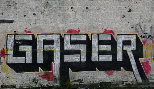
Let us begin with a simple old-school (not wild style) piece by Gaser (photographed on November 26, 2006):

Gaser
Note: If you want to see a larger image, you can click on the image and thus be taken to my Flickr site, where I store these images online.
Since description is at issue, let's begin with a basic description of the piece:
The letter-forms are simple block letters with 3D extensions. Notice that three of the letters - G S and R - ordinarily have curves in them, but Gaser has eliminated any curves in this version. He doesn't always do that, but he did it here. (This is, of course, common enough in display fonts.) Note also the downward extension of the “A” and the “R.” The name form is outlined by a narrow yellow stripe and set off against relatively small red “clouds,” as they are called - common practice. Notice “LOTUS” written at the upper right. I don't know whether that's a crew, a girlfriend - real possibilities, or something else. The letters stand man-high off the ground, about six feet.

Finally, the yellow stripe across the middle appears to be a “slash” (mark of disrespect) by another writer. This Gaser piece is next to another piece of similar size and style that has been extensively slashed, though not completely “gone over.”
That description is about as straight-forward as it gets. Note, however, that it only really works if you've seen the photograph or the piece itself. Without the photograph, for example, the description doesn't really tell you much about the letter forms. It doesn't tell you that they are all of the same height, except for the downward extensions on the “A” and the “R,” though you might make that assumption based on your knowledge of standard letter forms. Nor does my description tell you about the black lines in each of the letter forms. Nor does it tell you the angle and depth of the 3D extensions. And so forth.

It would, of course, be possible to describe many of those things. But the description would be a long one. Describing visual forms is difficult; hence the saying, “a picture's worth a thousand words.” If all graffiti was like that Gaser, the point would be fussy and pedantic. Most of the pieces I've photographed, however, are not that straightforward. They are far more resistant to such easy description. The forms in them do not have common names that we can use in describing them.

Here's a more recent Gaser. I photographed it on August 8, 2007, but it wasn't there the previous time I'd visited the site, August 1.

gazer red and purple.jpg

This is wild style. To be sure, the forms are compact and regular. But the letter forms are not immediately apparent. That's wild style, a very general concept that covers a great deal of stylistic territory.

How It's Done, Part 3: Project Management (GVM008)

Whatever the artist wants, the artist gets, coffee in this case:

20140905-IMGP9877

Checking the project plan (notice the relaxed configuration of the ocular photon filter):

20140905-IMGP9920

Wednesday, September 17, 2014

Citizen Scholars in the Digital Age

Tufts University Professor Gregory Crane, Editor in Chief of the Perseus Project, has recently drawn attention to the need for "a new culture of learning" not only for the field of classics but also more broadly. According to Crane: "We need to engage our students and fellow citizens as collaborators. We need a laboratory culture where student researchers make tangible contributions and conduct significant research." Crane argues: "The crush of data challenges us to realize higher ideals and to create a global, decentralized intellectual community where experts serve the common understanding of humanity.
Later, toward the end:
At colleges and universities across the world, for example, Wikipedia write-ins and edit-a-thons have introduced students and community members to the assumptions, biases, and absences of one of the most visited websites in existence. In a similar fashion, we might adopt strategies from the open-data and civic-hacking communities and have students evaluate institutional resources both for openness and for the variety of practical factors that can affect a user's access to information.

Librarians and others are also developing innovative campus spaces, including incubators and maker spaces. Infused with the energy of the guild and with the ethos of the commons—in other words, with collaborative, self-reflective, critical, and active "making"—such places have the potential to make visible for many users what has been invisible, including political, social, and material hierarchies.

We must insist on and enact more reciprocal, open, and community-based terms of digital engagement in higher education. The present foregrounding of abundance and connectivity has emphasized volume and scale. The danger in this view of abundance, whether of rich data or of ubiquitous access, is a false sense of completeness and equality. To a surprising degree, we have ceded control and critical perspective in response to the promised potential of volume and the large scale. At the same time, we have accepted use models that exist in a highly commercialized and politicized environment.

Kidz these days, jazz is corrupting our youth...

...and you were there


Though it's not identified as such, I think this is a clip from an old TV show called "You Were There", which purposted to re-enact historical moments. Or it's something like that. The man reading the news looks like young Walter Cronkheit, though I don't think he was associated with that program. Whatever. But TV didn't exist at the time the Original Dixieland Jazz Band was making their first recordings (the 1910s).

Graffiti Aesthetics: Five Easy Pieces

First published at The Valve in 2007.
Even as Tim Burke had been calling for explicit and focused aesthetic commentary on popular culture, I was thinking of making a few aesthetic observations about the graffiti which I've been documenting since 2006 (cf. Shrine of the Triceratops). As some of you know, this kind of graffiti is based on the name; the graffiti writer paints his or her name, sometimes simply as a tag, sometimes a bit more elaborately as a throw-up or throwie, and sometimes in an often highly elaborated form known as a piece (for “masterpiece”). When the so-called Wild Style emerged in the late seventies, the letters became elaborated in such a way that it was very difficult to read the name unless you already knew what it was. At this point the name seems to function primarily as an abstract framework upon which the writer crafts a design, much as blues musicians work endless variations on the same basic chord progression.

Let's begin with a very simple, and readable, piece by Ceaze:

Ceaze, On Coles

Note: If you want to see a larger image, you can click on the image and thus be taken to my Flickr site, where I store these images online. 
The letters are simple bold block letters with 3D extensions. The faces of the letters are lightly painted in patterns which do not follow the logic of the letter forms, but rather “cut across” it in visual counterpoint (look at the first “E” and the “a”). The letter forms are outlined in hot pink and a light blue that contrast nicely with the neutral tones of the letters themselves. Finally, notice the “sparkles” and the reference to his girlfriend Jen (at the top) and his crew, MSK, at the lower right.

This piece has been weathered for a few years, which probably has dulled the colors a bit. I don't know how it would have looked when freshly painted. A few months after I took that photo Ceaze painted over it with another piece, in a more elaborated style.

But not as elaborate as we see here:

Ceaze Green

This was painted in 2005 (look at the lower right) and seems to me an example of the kind of baroque over-elaboration to which the style is prone. If you know the name, you should have relatively little trouble making it out, otherwise you may be mystified. But that is, at best, a secondary or tertiary issue. What I find bothersome is that the image lacks an overall visual form or focus. It is just a fussy mass of detail: grey, green, red, blue, and yellow. I'm sure there's a logic to it all, that it took care and skill to work it out, but I do not find the result very compelling.