What’s going on in that photograph? I know, it’s subjective; you see things differently than I. But I shot it, so I ought to know, but do it?
The thing is, photographs are most often complex objects – that one certainly is – so there’s lots to see. I may have taken that shot, and I certainly had something in mind when doing it – but that hardly implies that I was or even now am aware of all that’s there.
But does all that’s there matter?
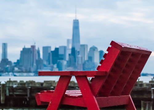
What I mostly had in mind was the dramatic contrast between the red of the chair and, well, everything else.
I also thought of “The Red Wheelbarrow” of William Carlos Williams. There’s no wheelbarrow in the shot, but, red, yes indeed! And one might see a similarity of shape between the wheelbarrow and the chair, where the back of the chair corresponds to the handle and the seat, arm rests, and legs correspond to the body.
One might see that. Did you? Does it matter?
[Not so much, I think, not so much.]
But, really, that was only in passing, yet given the cultural importance of Williams and the fuss that's been made over that particular poem, that flicker of a thought is of interest.
There’s obviously a lot more going on in that picture. I am not unaware of the identity of those buildings in the background, and the fact that they are not in focus does little to hide their identity. Whether or not you recognize them depends, of course, on your general knowledge of major cities, one city in particular.
Whatever your knowledge, of course you recognize that there’s a city in the background and that it’s on the other side of a body of water. That’s right there in the photo and requires no special knowledge of anything in particular, except of (large) cities – knowledge not universally shared among humans, even in these days of internets and cell phones.
The city, of course, is New York City, and that’s lower Manhattan. But that’s not quite the most identifiable part of NYC’s skyline. That would be mid-town, with its iconic Empire State Building. Lower Manhattan used to have the Twin Towers of the World Trade Center – love ‘em or not – but they fell over a decade ago. That building you see in the center is what replaces them. That building’s not so well recognized, though the controversy surrounding it has certainly been in the news.
You may recognize that building, and it’s location, without quite recognizing that district as Wall Street, New York’s financial district. That’s where the self-styled Masters of the Universe run things, or so they think. That’s where fortunes are made and economies wrecked.
That DOES matter to me, the contrast between THAT and the RED CHAIR. I’ve got a whole series of photos I’ve called “Distant Empire.” The Empire State Building figures in each one of them, sometimes prominently, sometimes not; but it’s always there. The Empire State Building is a somewhat tarnished symbol of empire, iconic though the building itself is. Which is part of the point, that and the distance between empire and the rest of us.
I’ve got much the same think in mind in that shot of the red chair and the distant city. The red chair is us, where we live. That distant city is another planet, one not necessarily hospitable to us. Now that I’ve pointed it out, you can of course see it. But would you have otherwise?
And does THAT matter?
I’m not sure.
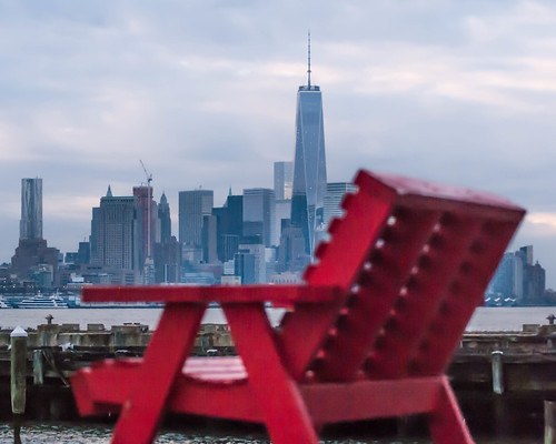
Here’s another photo:
‘It’s very much like the first. Same subjects. The aspect ratio is different and the coloring is a little different. The major different, though, and the one that should pop out at you, is the location of the focal plane. In that first shot the chair was in focus and the background blurred. In this shot that’s reversed. The background is in focus, but the chair is blurred.
Does that matter? In both cases there’s no mystery about what we’re looking at. If you didn’t recognize One World Center in the first photo, it’s not because it was blurred. Does the shift of the focal plane to the buildings shift the emphasis of the photo? I mean, that red chair, blurred though it now is, still dominates the shot.
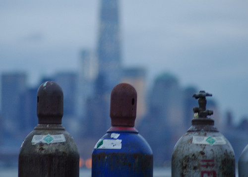
While you’re thinking about that, consider another pair of photos. We’ve got the same background image, the same difference in focal planes, but a different foreground image. How does that play out?
Now – here comes the hard part – imagine that you saw just those four photos, without any of this prose. What would you see? How would they play against one another?


No comments:
Post a Comment