There is this word, “photorealism”, which refers to the quality of an image that has been drawn or painted. Not only does such an image represent some object or scene in a “realistic” manner, as opposed, say, to an impressionist or cubist manner, but it does so as well as a photograph. “Photorealism” designates a standard, one defined by a technology, photography. One of the defining characteristics of this technology is that the image is imposed on a surface, a chemical emulsion or an array of electronic senses, in a purely mechanical way that is true to the geometry of the scene as conveyed by light.
But, in what sense does the photographic image depict the visual world as it “really” is?
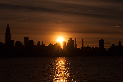
Here’s a photograph of a sunrise as it came out of my camera and into Adobe’s Lightroom rendering program:
That’s not what I saw as I took the photograph. It’s much too dark.
Which am I to believe, the truth-telling camera or my lying eyes?
Both.
The reason that image is so dark is that, by pointing my camera directly at the rising sun, I flooded it with light. That’s one thing. But there’s something else. The sensor can handle a wider dynamic range than any monitor can display and than can be realized on any photographic paper ¬– this is a problem that Ernst Gombrich explored at some length in Truth and Illusion, though he was interested in painting, not photography. So the software has to compress the image in order to display it. That darkness is the result of that compression.
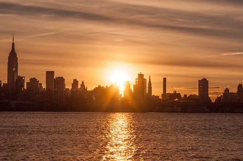
Here’s the same image after I’ve done a thing or two with it:
This image is brighter over all and it has much more definition. The buildings of the skyline are no longer lost in dark shadow. You can now see distinct buildings and even see features of some.
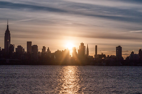
But it’s still a little dark, and, as I recall, the sky wasn’t so orange-yellow. You can see it bit of blue at the top, but there was more in the sky that I saw that morning. More manipulation is called for:
That’s better. It’s still a bit dark, but the range of colors is more accurate. Note, however, that in adjusting the color, it’s not as though I can look out the window and compare the sunrise with the image on my monitor. The sunrise is long gone. I’m doing this from memory and, inevitably, with respect to my general sense of what sunrises look like.
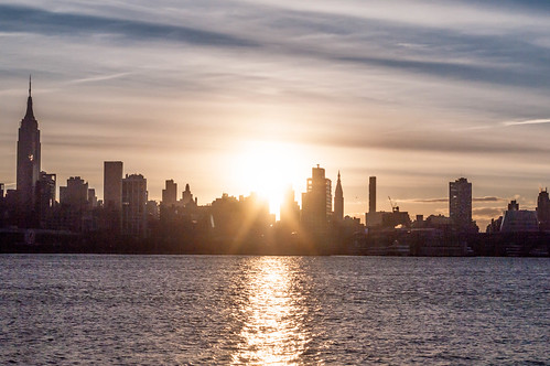
Let’s take another crack at it, to lighten it up:
That’s better. Perhaps just a little too light, but I’ll let things alone for awhile. Notice that I’ve still managed to preserve some detail in the buildings. Of course, at the point where the sun is rising above them, the brightness of the light simply obliterates them.
They’re still there. Look at that first image, the dark one. There's much more definition to the buildings at the point of sunrise and, correlatively, the image of the sun itself is also more constrained and well defined. Could we have both, an overall brighter image, and well-defined buildings next to the sun? Probably, but it would require more manipulation than I'm willing to do, and a bit trickier.
This is fine.
As I said, for now.


No comments:
Post a Comment