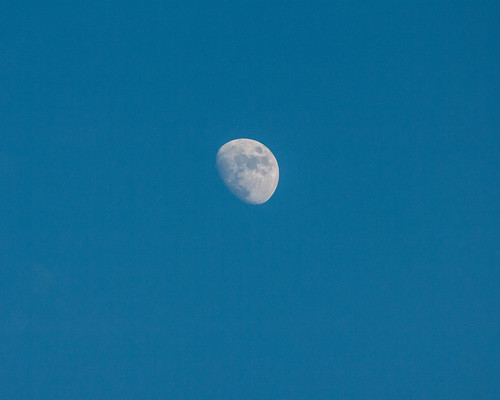
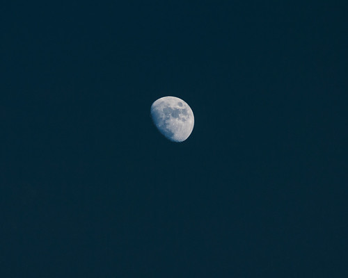
Here's photo of the Moon that I took the other day. Nothing special, just a nice clean shot of the Moon in sky empty of clouds, contrails, birds, helicopters, and planes:
Precisely because it is a clean simple shot I decided to run some Photoshop variations on it. It's an exercise in minimalism. Since the basic image material is simple, the variations "show" more strongly.
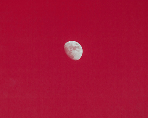
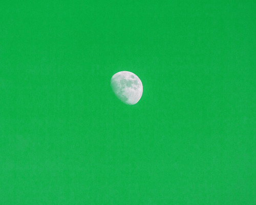
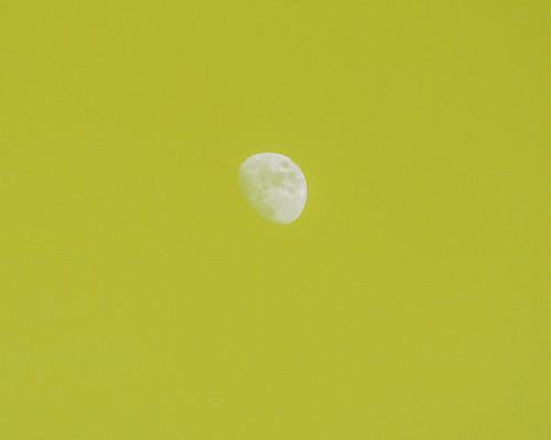
I do this every now and then without any specific purpose. It's just an exercise. When I do it, just about the first thing I do is to create red, green, and blue (RGB) versions of my source image. Since this one is already strong medium blue, I just needed to do red and green versions. I then decided to toss in a yellow one as well.
Notice that the yellow is a bit desaturated. I couldn't get a highly saturated version using my favored techniques, so I left it at that.
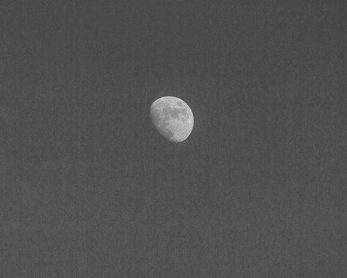
Once I've run the basic color variations I often do a gray scale image, like this:
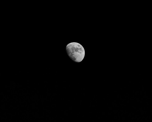
Notice that the sky is slightly splotchy. It didn't appear that way in any of the color versions, but in gray scale, there it is. I wonder why? Here's a different version, where the sky is black:
I like that. Here I fade the black over the blue original:
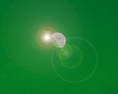
Now let's play. Photoshop has a bunch of filters that let you alter the image quite a bit. I've played around with some of them from time to time, but I don't generally use them very much. One of the filters puts lens flare into the image. I'd never played around with it very much. So I decided to give it a try. This is what happened when I applied to the green version:
I'm sure it lets you play around with the flare pattern, but I didn't bother. That's what came up the first time I applied the filter.
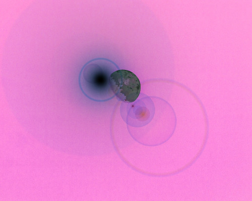
Now we invert the image:
That's getting interesting. Perhaps a bit fruity, but interesting nonetheless.
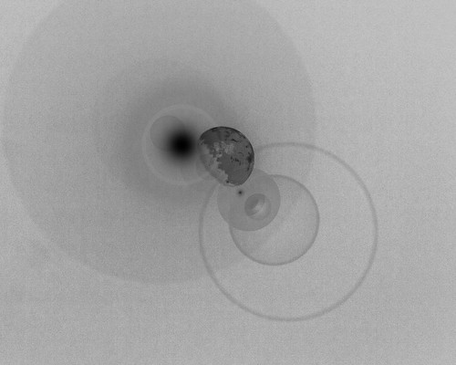
And here's a gray scale version:
I didn't some other versions, but that's enough for now. Who knows, maybe I'll play with the flare a bit more, see what kind of control I can get.
No comments:
Post a Comment